The Future’s Not So Bright
March 2nd, 2006I read Jason O’Grady’s comments (via Daring Fireball) on the keyboard backlight of the MacBook Pro with some surprise. I am the proud owner of one of these new machines, and his experience doesn’t exactly match mine.
Granted – I don’t have a PowerBook G4 to compare against – I haven’t owned another Mac laptop since my iBook G3, which certainly didn’t have any of these fancy backlighting features. But the staring into the sun metaphors alluded to by O’Grady seem really far-fetched. Unfortunately, he only shows us images of the two laptops at “half intensity,” while mentioning in passing that the MacBook Pro’s “keyboard backlight set to one bar is brighter than the keyboard backlight on the PowerBook set at 16 bars.” Where are the pictures for this – the interesting claim?
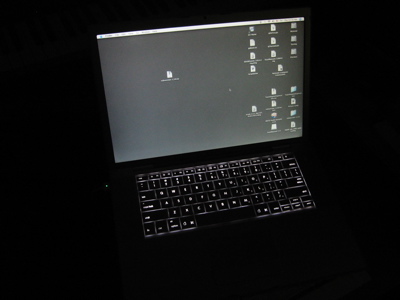
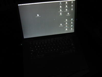
I’m also skeptical because the keyboard images are being shown out of context. We don’t normally stare down into our keyboards without the (usually more powerful) light of the laptop display to soften the relative intensity of those keyboard lights. I thought I’d contribute another set of photos which may at least offer hope to those of you who are starting to worry about SPF factors in relation to your future laptop:


The first is at maximum keyboard backlight, the second at minimum. Obviously, my photos might be deceptive, too. But all I can say is that dim version looks “pretty much” the same as it looks in my office. Maybe O’Grady got a defective keyboard? I would like to see a picture of this retina-burning “lowest setting.” If the dim version shown above is brighter than the maximum brightness of the G4 keyboard, I’d say it’s the G4 that was defective!


March 2nd, 2006 at 12:07 pm
As I mentioned in my comments on the znet site, he was comparing the keyboard against a PowerBook G4 1.5Ghz. If he would have done some research, he would have known that they did in fact increase the brightness of the keyboard backlight between the 1.5 and 1.67 revisions. It’s noted in the documentation and was marketed as one of the selling features of the last revision. So, it has nothing to do with the MacBook Pro, it’s simply that the MBP got the same keyboard as the last model PBG4 which is brighter than the older PowerBook’s.
March 12th, 2006 at 1:24 pm
I think one aspect of the revised lighting strategy on the new laptops that is confusing people is what happens when it is neither light nor dark (twilight). The older machines (I had a 17″ G4 1GHz) would ramp up the intensity of the keyboard backlight inversely to the ambient light in the room in a purely linear manner. One can see how this would seem to be a good idea, the darker it gets, the brighter the backlight gets. Unfortunately due to the color of the backlight (white) and the color of the keys (silver) there was a period when the backlighting of the keys would make the letters on the keycaps seem to disappear altogether and one was actually better off switching the backlighting off. They appear to have “fixed” this by (to my eye) adjusting the brightness of the backlight on some kind of curve that makes it extra bright at the problematic ambient light level thus solving the problem of the disappearing keycaps. Personally, I feel the keyboard backlighting comes on too soon and could be left off way past this point which would also solve the problem. All in all, I find the new backlighting to be merely different than the old, I spend just as much time manually adjusting it as I did before, just at different times. However, a backlit keyboard is so useful that I’m more than willing to put up with a little hassle to use it.
November 8th, 2011 at 4:28 pm
Really nice entry! I have enjoyed reading your blog. Surely I will subscribe your blog so maybe I’ll come back soon. See my site http://www.free-ebook.pl – there is a lot of very time-consuming stuff, but really worth reading