Picking Off iCal’s Paper Bits
July 23rd, 2011OS X Lion brings dramatically redesigned versions of the classic iCal and Address Book applications. Many people, or at least some important decision makers inside Apple, are very happy with these changes. Other folks, such as myself, believe they look and behave like crap.
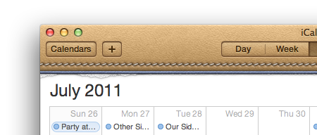
When I first saw the Lion version of iCal, my eyes were drawn to the obnoxious bits of paper that cling to the top of the window, artificially and pointlessly leaving the debris that you might find on a real-life calendar with removable paper sheets:

As Cathy Shive pointed out in her NSConference talk on user interface metaphors, the presence of junk like this in an application is at best useless, at worst distracting and detrimental to the usability of the application. I remember her saying in her talk, before Lion’s iCal had even been presented in a private developer beta, that little things like paper scraps in an application are particularly annoying because she always wants to try to pick them off just as she would with a physical object.
Lion has given me the opportunity to empathize deeply with that concern. I hate those cruddy paper bits, and I can’t pick them off! Or can’t I?
To clean up your copy of iCal on Lion:
- Select the iCal application in the Finder and press cmd-D to duplicate (make a backup, for safe keeping).
- Control click the application icon and select “Show Package Contents.”
- Navigate to Contents/Resources/
- Select “CanvasTopTile.png” and open it up in Acorn or another, less attractive image editor. Or download my edited version and replace the original file.
- Select the paper bits and “clean them up” by deleting them.
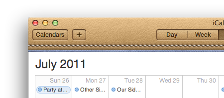
- Reopen iCal, and bask in the glow of your clean white calendar:

Granted, this only fixes the paper bits. You’re still stuck with that horrendous tan leather toolbar. But at least that doesn’t beg to be picked at. It’s worth noting that the tan leather can also be tweaked by editing a variety of other image resources in the bundle. It’s trickier because many of the graphical components of the toolbar are designed to blend with the leather background, so you’ll end up having to change quite a few of the images.
I’m reminded of another great observation Cathy made in her talk: when you make very stylistic choices like this for a user interface, you dramatically increase the variety of reasons that the customer can be repulsed by the design. What if I don’t like leather? What if I don’t like tan leather? What if I prefer a running stitch to an outline stitch? You can argue that matte grays and subdued color gradients may invite the same controversy, but there’s a reason they are so common in user interfaces: because they’re far less likely to distract from the form and function of the application itself.
Addendum: Updating the iCal code signature. Thanks to rentzsch and daagaak on Twitter for pointing out that editing the resource will break the “code signature” on the application, put there by Apple to assure users that the application 1. Was developed by Apple, and 2. Has not been modified by anybody but Apple. You can re-sign the application after tweaking it, to put it back into a “signed” state, albeit not by Apple. Hopefully this will prevent it from prompting you all the time about approving connections to services like MobileMe. From the Terminal:
codesign -f -s - /Applications/iCal.app
This reveals how little things like tweaking an application’s resources have wider-reaching consequences than they used to. I’m pretty sure you won’t miss any functionality in iCal by using a self-signed copy of the app vs. an Apple-signed version. But I could be wrong!


July 23rd, 2011 at 4:16 pm
Apple spends millions to make its headquarters, stores, and hardware as “sleek minimalist” as possible. Apple has spent millions to make Cocoa provide UI elements that all programs can use, that are “sleek minimalist” design.
Then Apple rolls some dice and says, “You know what, let’s make the calendar and the address book 100% realistic leather desk accessory.”
Your article is hinting at the WTF that results.
Now, why is this OK on the iPhone? If I had to guess, it’s because on iPhone, since there’s only one app on screen, and the screen is small, having unique looks is a good idea, helps users differentiate.
But on desktop, where the user often has 12 apps sitting side-by-side, it just screams “tacky mismatched UI junk.” At least to me, and you, and probably a lot of other people.
There is a design ethic called “shabby chic” where it’s OK to have intentionally mixed and mismatched stuff, for example, plates and utensils.
But “Sleek Minimalist” is the mortal enemy of “Shabby Chic.”
July 23rd, 2011 at 4:18 pm
The paper bits aren’t a deal breaker for me, but I would like to be able to change the appearance of the tool bar – gray leather; denim?
July 23rd, 2011 at 4:18 pm
Anyway, either Panic, or you, can write a little “UI replacer” for iCal.
Unfortunately, you can’t sell it in the App Store (because App Store apps are sandboxed, and therefore cannot go messing with other apps).
July 23rd, 2011 at 4:21 pm
When I saw the torn bits of paper for the first time, I thought, “I don’t like torn bits of paper on my physical calendar, why would I like them on my electronic one?”
In other words, I’m not necessarily opposed to hints of the real world in UI design, as long as they’re not obtrusive and/or ugly. Why not graffiti and dent the side of the trashcan in the dock to match those in the real world?
July 23rd, 2011 at 4:22 pm
This makes me long for ResEdit.
July 23rd, 2011 at 4:24 pm
Love the tip–it’s kind of the same mistake as using a “full” or “messy” icon for Trash when it contains items. We want to clean it up. My favorite part of your post, though, was, “or another, less attractive image editor.” Nice touch!
July 23rd, 2011 at 5:11 pm
Hey @Doug Adams, the good news is that you don’t need ResEdit. Just use any old image editing program and go wild.
But yes, I also miss editing black and white icons in FatBits. (Pours out some malt liquor for Fat Bits.)
July 23rd, 2011 at 5:42 pm
I also found this tip to completely remove all traces of the leather. Haven’t looked into either method yet but about to before I let my eyes bleed anymore from looking at them.
http://macnix.blogspot.com/2011/07/change-mac-os-x-107-lion-ical-and.html
July 23rd, 2011 at 5:50 pm
Michael, be careful or someone at Apple will read this and change the trash can to be just that.
It’s especially grating that Apple’s UI designers have become so divergent in the approach discussed in the article: consider that, while the “Base Window” of apps like iCal have become more exaggerated and colorful than necessary, standard elements such as toolbars have gone so far in the other direction (bland) that it’s become an obstacle to use.
For example, all toolbar icons are now small, flat, medium-light-gray on medium-dark-gray buttons with actual button borders and no text labels. So what was once a colorful, descriptive, large action button is now a tiny incomprehensible symbol. To further injure the user, the difference between an active control and an inactive control is only clear when looking at the two side-by-side. The lack of contrast and color in the UI is productivity-sapping in the confusion it causes and the extra time required to act.
Finally, after spending “millions of dollars” on a new background for their app, they spend about $10 to have someone make the icon for “Launchpad” in about 20 minutes. Thanks Apple! Launchpad, iTunes, the App Store…
Far from being simply a “taste” or “comfort” discussion as the article covers fairly, the toolbars, the app icons, and the custom UI backgrounds signal a very dangerous and costly future for users and developers on the Mac. What Apple does developers imitate, and here’s what we’ll see more of:
– Bland, indistinguishable apps. Is that Mail, Safari, Finder, or MyApp? Who knows!? They all look the same
– Indistinguishable icons. Where is the icon in the Dock? Can’t see it!
– Impossibly high costs on “Graphic Art” (as opposed to real UI Design) for a nice “leather” window. Shoe-horning UI elements into such a motif – starved of investment of time, money, and care into usability – will create extra clicks, pauses for thought, and customer-service requests.
In short, a total backfire for the users and the developers. There’s lots of great things in Lion, but these aren’t them.
July 24th, 2011 at 2:15 am
I personally like the real world metaphor, especially on my iPad and I guess because of that, it really doesn’t bother me in the slightest on the desktop. I’m guessing Apple decided to maintain the look of the app across all of their iOS and Mac OS devices for continuity’s sake? At any rate, I hadn’t even considered it an issue til I came across your post. Love the Acorn dig! :)
July 24th, 2011 at 2:46 am
Even more frustrating is that the bit of paper tells us is that going backward in time is kind of forbidden because the previous month was scrapped. So doing the new-uber-cool-flip-a-calendar-page gesture to go back a month is against the metaphor.
July 24th, 2011 at 2:55 am
I like the calendar and address book. Maybe it’s because tend to run apps full screen (small screen), so only one in view at a time? Even if not, I like differentiation between windows.
I think sometimes people spend too much time fussing over the details.
July 24th, 2011 at 7:51 am
I agree with MarkBerry; I like the visual distinction.
I think another potential down-side to self-signing is that accessing keychain items is associated with the signature, so every time the app is upgraded you will be prompted to authorize access to each item.
July 24th, 2011 at 12:29 pm
This must be why I like to think ima geek, but realize sometimes I may not be near the one I want to be. Until reading this,I was not even aware of the stylistic ( or un-stylistic, or at least un-preferred stylistic) features in the new iCal app on the desktop. I am still reveling in the features that weren’t there before that I’m enjoying. Sometimes it may be good to realize one’s point of view may simply be that…ONE’s point of view. As a most likely longstanding typical user who can really only speak for myself and not even assume I’m doing so for others, I read your comments and the ones noted from Cathy and thought, “Jeesh, can someone be more OCD about something as little as the little paper tears I didn’t even notice until mentioned?” So…sometimes it’s just your preferences and not those of all or many, or maybe even a few. My two cents…but really, just mine.
July 24th, 2011 at 1:28 pm
This is one of the most badly written articles I’ve read in awhile.
“Lion has given me the opportunity to empathetic deeply with that concern.”
Jesus.
July 24th, 2011 at 1:35 pm
@Steve – Thank you for catching the typo.
July 24th, 2011 at 2:37 pm
“the presence of junk like this in an application is at best useless, at worst distracting and detrimental to the usability of the application”
Um, it’s actually intended to be fun. No, it lends nothing to the usage but neither do a million other things in GUI’s. And it sure isn’t “detrimental to the useability of the application”, unless you are obsessive compulsive or anal retentive. No offense to you or Cathy, but there are worse things to gripe about. I don’t really like the look either but c’est la vie. Not using iCal might be another solution if its that much of a hindrance to you…
July 24th, 2011 at 2:47 pm
@Greg Thanks for the differing point of view.
“Sweating the details” is one of the joys of working on Apple stuff. It’s these little things that need to be thought through, criticized, and understood, in order to always strive for better, more usable software. It’s always been the way Apple has made me feel about designing software, so I turn it around and expect Apple to apply the same standards to their own work.
July 25th, 2011 at 4:37 am
Except Daniel that the standards they are applying are good IMHO. I WANT some fun injected into my computing, and love that we’re moving towards a less clinical, drab existence. These things in iCal don’t distract, they simply give you a real world clue as to the purpose of the app, though I do accept that it’s a fine balance between that and something that DOES distract.
July 25th, 2011 at 9:46 am
I noticed you wrote a blog complaining about a few pixels on a computer program. That’s cool.
July 25th, 2011 at 12:34 pm
@MarkBerry says, “I think sometimes people spend too much time fussing over the details.” That’s what good designers do :)
@Steve: Talk about poorly written. Your screen name is Steve, but you signed off as Jesus. :P
July 28th, 2011 at 9:11 am
Daniel,
I saw this and then I saw this:
http://www.simpleandusable.com/news/how-to-remove-the-faux-leather-in-ical-for-os-x-lion.html