Size Doesn’t Matter
May 25th, 2007I’m playing with some design changes for MarsEdit’s main window, and thinking it will probably end up mimicking the classic “Mail source list utility bar” appearance, where a few small buttons appear beneath a source list at the left-hand side of the window.
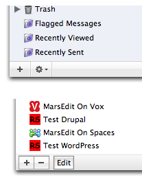
With things in flux while I moved bits and pieces of the UI around, I was able to observe a pretty stellar example of how the visual placement of objects within a container can dramatically change the appearance of the container’s size. Consider these snapshots, taken from Mail and this experimental version of MarsEdit. Stare at the buttons on the Mail version (top), then at the buttons on the MarsEdit version. Which section is taller?

Answer? They’re exactly the same height. 23 pixels tall. The crowdedness of the MarsEdit version makes the whole section seem way shorter than it really is, while the Mail version has miles and miles of room to breathe.
It occurs to me that this illusion might not affect everybody the same way. To me the difference is stark, unless I start fixating on the blank part of the bar, when I can more easily accept they are the same size.


May 25th, 2007 at 9:46 am
How eerie that you post about interface design when I just did the same on my blog…
Anyway, that’s the big gripe of designing interfaces that house graphics beyond your anticipations. You can ‘beautify’ images you will contain in your app with common methods (see Apple’s iWeb; reflections for images or simple Core Image filters on command can help fit things in the general feeling of Macness), and in your situation, an example would be giving the favicon more ‘room’ by forcing it in sub-standard sizes.
There are obvious disadvantages for this, and obvious advantages. As you said, room and negative space plays a huge role in typography, and thus, interfaces in general.
I am quite curious as to where you are going interface-wise with MarsEdit, I’m dying to find out ;).
May 25th, 2007 at 9:57 am
Daniel,
I’m considering a status bar that looks like this: http://inessential.com/?comments=1&postid=3345 for my app.
I think it will look more appropriate in Leopard, since they seem to change everything to dark grey.
May 25th, 2007 at 12:02 pm
Daniel:
My eyes see the same as yours. Yes, the Mail bar definitely looks thicker. In fact, I had to read the end of your entry twice to believe that they were really the same size.
May 26th, 2007 at 10:03 am
Daniel:
The greater spacing between the mail items makes it much easier for me to focus on individual items in that example. I’m not sure how much the difference between icons in the two examples also contributes to this effect.
May 26th, 2007 at 10:13 am
That screen grab must be from a beta NNW (I’m running the latest golden). If so, I need to get on the beta list and file a bug since the gray border along the top of the plus button is darker (#CA) than the one along the top of the gear button + rest of status bar (#D3).
Yeah, I have to live with myself.
May 26th, 2007 at 1:56 pm
Rentzsch: pass the beer :) Just kidding, but there are no screenshots from NNW above :)
Good eye – it’s a Mail.app bug, though. You can beta test my UI anytime!