Google Usability
May 29th, 2007Google frustrates me by highlighting in their products some of the best and worst of web usability.
Consider Google Maps, which won me over instantly when I first tried it, almost entirely because of the innovative (then) “drag to scroll” behavior you can rely on whenever you see a Google map.
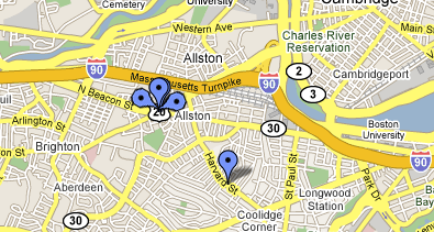
They won me over with a usability boon, which means I suffer through the usability gaffes. I often use Google Maps to locate businesses or other points of interest in whatever area I happen to be in. As luck would have it, the nature of businesses is that they cluster in one place. These are what our parents, who actually left the house, called “town centers.” So if I search for restaurants, I’m liable to see results like this:
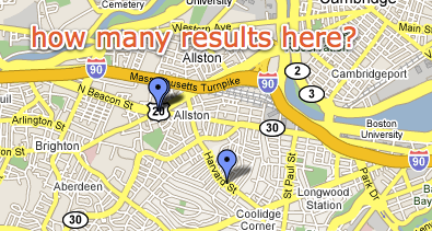
This particular map was actually sent to me by fellow Boston-area Mac developer, Paul Kafasis. He was pointing out some local restaurants I should try. But this problem is not unique to this map or even rare. In fact, often the pins line up even more perfectly, so that you literally can’t tell there are more than one at the location.
Google has tons of real-estate to work with here, but to find out what’s actually at the cluster point, I have to go back to the ugly list and click items to see where they pop up in the map. With all that space to work with, surely Google could come up with something better.
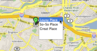
The peacock approach would work to at least allow several places to show up at one spot, yet still be clickable. The directionality of the pin makes it clear that they’re all referring to the same point.
Of course, it could get complicated if nearby pins overlap with “the peacock.” Perhaps a “drop-down pin point” would be better, clearly identifying a multi-hit location with a different color and interior shape:
Surely with a feature that is so central to the map’s usefulness, Google can come up with something that improves on the current behavior.