Insane in the UI Brain
May 24th, 2006(Note: Now updated with specific UI criticisms of Andrew Stone’s Videator application. Scroll down to the middle if you’ve already read the first part)
John C. Welch has posted a scathing critique of Andrew Stone’s new Videator core video application. In fact, he’s used his reaction to the application as an opportunity to confess that he thinks Stone is actually “batshit insane.”
I have to admit, the UI to Videator, and across most of Stone’s web site, looks more like something I’d see on a Phish poster than an awesome Mac application. Not likely to win any Apple Design Awards, I suspect. I remember when Mac OS X was first being developed, and lo and behold, this suite of Stone Design applications was already out the door. I never spent too much time with them, but remember being impressed that some alternative to major creative suite applications already existed for the future of the Mac. The reason I never used them is because they never “clicked.” The UI has always been a little off for the Mac, but Welch is right, this one is freakin’ insane. To add insult to injury, Stone lists the “intuitive, all-in-one interface” as one of the application’s selling points.
Whether that makes Stone himself insane is up for debate, but at the very least he could use a makeover. I see Stone as suffering from a couple major disorders: chronic clinging to outdated standards, and refusal to take conventional UI design rules seriously. He may not need a therapist, he may just need an intervention. We need a Bravo television show: “Mac Eye for the NeXT Guy.”
I have to concede a little admiration for Andrew Stone. The guy gets products out the door. He maintains, whatever that means, several products simultaneously and as far as I can tell stays financially afloat doing all independent software development. Kudos to Stone! That’s more than I can say for my own dilapidated software line-up. If he can do all that while still producing satan’s own UI experience, then more power to him.
If he’s surviving and getting press now, just think how well he’d do with a fantastic UI? Often when I mention UI design to developers I get a cold shoulder. Like, “I’m not a designer!” Fine, if you’re not a designer, you have two choices: either hire one or become one. My own design knowledge is bare-to-middling, but I know when something looks like ass. It turns out this is a big head-start. In fact, I know that most of my own web site looks like ass. I want to fix it, believe me! That’s why I’m dedicated to becoming a designer.
I’ll never be a great designer. I will however be an “OK” designer. Design is like cooking: you can learn to make something edible without much training. If nothing else, it’s worth it for all developers to learn design so that they know who to hire when they realize they don’t have time or talent to fix everything themselves. So how do you become a designer? I’m a fledgling learner myself, but here are several books I highly recommend in your pursuit of “fixing the design hole” in your expertise:
The Non-Designer’s Design Book is a great starting point for anybody looking to get their feet wet with design concepts. Robin Williams (not the comedian!) focuses on the four concepts of Contrast, Repition, Alignment, and Proximity. And yes, I did remember those thanks to the exceedingly useful mnemonic that comes along with them. She takes a stab at introducing you to these concepts through a number of “bad vs. good” comparisons. These exercises teach you to be a better critic. If you can tell when something looks like ass but never know why, her book may give you the fundamental tools you need to start making wise assessments.
Designing Interfaces is currently on the top of my list of design books. I’m about halfway through reading it, and enjoying every minute. This is the techie’s design book, if there ever was one. Anybody who appreciates design patterns will love the clinical yet common-sensical way that author Jenifer Tidwell elaborates on dozens of standard patterns in UI design (are you listening, Andrew Stone?). Patterns are fun to read about in both programming and other arenas, because they constantly give you that “oh, of course” feeling. While you’re technically learning new stuff, you’re really just reinforcing obvious stuff that you thought you knew but didn’t have the confidence to be sure about. Jenifer tells you you’re right for thinking that things like balance, alignment, and obviousness of effect are important to your application’s UI. Thanks to Jonathan Wight for recommending this book.
Don’t Make Me Think focuses on designing for the web, but is still quite an eye-opener for desktop application design. The underlying message of Steve Krug’s book is summarized in its title: users shouldn’t have to work hard to figure out how to use your application. This is so pertinent to Mac software design, it’s not even funny. Don’t make your users think. Don’t crowd up the interface. Don’t use non-standard controls. Don’t place verbs that users are unlikely to use on the same level as ones they are exceedingly likely to need. Make it clear what the heck your application does best and make sure the user falls feet first into that!
About Face 2.0 is the sequel to one of the first books I ever read about design: About Face. Although I haven’t yet read the 2.0 release of this book, I found the original fascinating and especially enlightened about the design of desktop user interfaces. It’s primary author Alan Cooper is regarded as the “father of Visual Basic.” I couldn’t help wondering while reading About Face why Microsoft hadn’t handed him the reigns to Windows as well. While the other books I’ve recommended will give you a steady footing in the basics of design, this book should help you connect the dots between those lessons in the abstract and the everyday UI objects of your daily development: Buttons, Checkboxes, Sliders, etc.
Update: Several readers offered additional suggestions in the comments below. I haven’t read these, but am adding them to my reading list based no their endorsement and their clear presence in the “aura of recommendations” surrounding the books mentioned above. “Designing Visual Interfaces” in particular I had already hopped onto my shopping list because of its positive citation in Tidwell’s book.
The Design of Everyday Things – by Donald A. Norman.
Recommended by Sascha Brossmann.
Designing Visual Interfaces – Kevin Mullet and Darrell Sano.
Recommended by William F. Adams (and implicitly by Jenifer Tidwell in Designing Interfaces).
Universal Principles of Design – by William Lidwell, Kritina Holden, and Jill Butler.
Recommended by Buzz Andersen.
The Inmates are Running the Asylum – by Alan Cooper. I just checked this out from my local library and I’m really impressed. I’m having a great time getting started on it – so much of what Alan Cooper says is “obvious in retrospect.” I love it!
Recommended by Andy Lee.
No Excuses
You’re a developer, but not a designer? That’s no longer acceptable. Let’s spend a little more time wrapping the product in something usable and beautiful. Our users will thank us for it, and it just might keep us from going “batshit insane.”
Update: Friday, May 26:
Wow! This post has really generated some interesting responses. I think partly owing to the visceral nature of John C. Welch’s original post, and partly owing to the strength of Andrew Stone’s good reputation, I am getting caught a bit in the crossfire. I really hoped that my criticism of Stone’s UI would be taken with the lightness I intended. I do think it’s bad UI, and I hope that he improves it by either hiring somebody or reading-up with an open mind. It doesn’t matter that he’s one of the oldest, most knowledgeable, and perhaps straight-out “best” Mac OS X developers on the planet. The product is frustrating and bad. The skills are not being put to optimum use.
Since the biggest complaint about Welch’s and my criticisms is that specific examples are not cited, I thought I would take some time to actually call out some of the first impressions that led me to agree with Welch’s assessment (about the UI, not the craziness). Below is a screen capture of the Videator UI that is very similar to one that could have been taken mere minutes into my first-run of the program. I’m not even a very good UI critic, but let me just take a stab at a few things that are wrong here, and why it’s frustrating to see an experienced developer (one whose company contains the word “design” no less) violate the user’s trust:
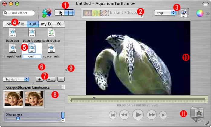
(Click for full-size image)
The first several labeled items in the screen shot have to do with the toolbar. But before I discuss those, I have a couple complaints that are not pictured. The toolbar is pretty offensive-looking in part because it contains a number of items of varying heights. It looks slightly less offensive when titles are turned on, because they “regularize” the heights. However, even doing this is non-trivial, because you first have to find the “Customize Toolbar” menu item. In every other Mac OS X application with a toolbar, you find this menu item in the “View” menu. In Videator however, since there is no “View” menu, you have to either know to right-click the toolbar for a contextual menu, or else find the menu items hidden way off in the “Tools” menu of the main menu bar.
The screenshot above is smallish partly so it will fit easier on this blog, and partly because being smallish exposes some of the worst UI glitches in the application. I would like to point out that when the window is biggish, the toolbar items float in a way that looks very awkward at first and only slightly less so when you figure out the minor rhyme to Stone’s reason. The gigantic “Instant Effects” popup in the middle of the toolbar is surrounded by expanding space such that, as the user resizes the window, the items to its left float left, the items to its right float right, and it stays more or less centered. Although I guess Stone might argue that the item is central to the application’s functionality, the weird alignment just seems weird. One of the take-aways from the Non-Designer’s Design Book is that you should pick an alignment, probably flush left or flush right, and stick with it unless you really know what you’re doing. If the user thinks one of your toolbar items should be put up on a pedestal, let them choose to organize things that way.
1. Funny Segmented Control. One of the first things that jumps out at me is that this funny segmented control has graphical content that appears ready to jump out of the control. The meaning of the icons is pretty obvious, thanks to the use of industry standard icons, but the lack of centering makes it look like this is a rush-job that hasn’t been refined for shipment.
2. Huge Popup Control. This popup control appears to have some kind of customized graphical content – perhaps representative of whatever the selected item is? It turns out the displayed content is always the same, and never changes to reflect what you’ve just selected. The “Instant Effects” title reflects the fact that anything you choose from this menu gets instantly applied to the working document. Since the state never changes, there is no excuse for the awkward height and width of this item. It, more than any other item in the toolbar, contributes to the sense that toolbar items are all over the board in terms of both height and width. For some reason Stone decided it was very important to represent this popup as a huge graphical/bigfont item, while the neighboring “export type” popup is just plain text.
3. Image Drag Well. I wouldn’t have known what to call this if Stone didn’t give it a name that shows up when you turn titles on in the toolbar. Unfortunately, if you haven’t turned on titles or hovered over the item with tool tips, it’s impossible to know what “png” means. It turns out it means that it’s the format any exported image will assume. The well next to it? My first impression is that this is something you drag an icon to. But it’s in fact something you drag from. See, together these items make up the “export an image” functionality that in a well-designed application would probably consist of a Preferences option for the type, and “just dragging from the movie.” To make matters worse, the popup menu for file types includes one non-image-format type: “effects”. JPEG, Tiff, or Effects? Hmm. If you choose this from the popup then the well loses its icon badge and becomes, for all I can tell, meaningless. I don’t know how to complete the expected user action when Effects is chosen.
4. Tab View Language Abuse. These abbreviated, lower-cased tab view titles scream “X-Windows” or something at me. I can empathize with the problem that must have motivated Stone to adopt this disgusting naming convention: the spelled out words would require a tab view that is too wide. I’m not saying this is easy to fix, but when a good designer encounters a problem like this, she challenges her assumptions and comes up with a solution that does not involve compromising the laws of UI language. In this case, perhaps a collection of small icons would be appropriate. It’s true that I was able to correctly interpret “pix, flix, and aud” as “Images, Movies, and Audio,” but it took work. More work than I care to give an application. Applications are supposed to make my use of them effortless and fun. It’s not fun to cringe at what look like typos in the UI. Furthermore, there is no easy distinction for me between “fx” and “my Fx.” I can sort of guess at the distinction, but since this application came with a bunch of items already in “my Fx,” I can only argue that they are in fact not my Fx, they’re Stone’s!
5. Ouchy Selection Feedback. Ouch! It hurts when selecting something in a matrix turns the background white, puts a selection rectangle around two UI elements at once, and invokes a time-honored cue (or something close to it) for letting the user know that they are now editing a text label, when in fact they are not. This is yucky! Use a standard selection-indicator convention. Enough said.
6. Extreme Lack of Contrast. Part of the problem with the white-background above is it draws to light just how much metal there is in the window, and how much less of it there should be. If the background to this matrix view and the one below it (label #8) were white, it would probably increase the overall ease or parsing the visual landscape, while making it easy to use a conventional selection metaphor instead of the invented yucky one above.
7. Ellipsis Abuse. The presence of the ellipsis symbol in Mac OS UI has a long history as a cue to the user that invoking that item will present further UI interaction. In other words, get ready to answer more questions. So what’s the difference between a plus sign and a plus sign with ellipsis? In this case, both buttons present document-modal sheets. But get this: the one without ellipsis is for saving a new gallery, while the one with is for reading one in from disk. The tool tips for both use the word “New” to the exclusion of either “Import” or “Save”.
8. Messy Overlap City. This is not a contrived situation. I just rearranged the panes in the application to my liking and resized the window to a certain smallish size. Suddenly I’ve got two or three UI elements all vying for this space of the UI. That looks like crap and tells me that the author either expects me to “look out for myself” when resizing the window, or they don’t care whether it’s easy to make their application look even more yucky than it first appeared to be.
9. Freaky Disclosure Thumb. What is this backwards disclosure triangle doing in the middle of my screen? It turns out it’s a split view thumb. Why invent a custom split view thumb that happens to strongly resemble a standard UI element with much different connotations? In a very twisted way, it does sort of behave like a disclosure triangle. Only, it never faces downward like a standard icon would. Its main innovation over a standard split view icon is that it points in the direction that the pane would expand or contract when clicked. And it only requires one click to expand or contract. But it also behaves as a draggable thumb, and is all in all very insulting to my understanding of what a little triangle should do on a Mac window.
10. Clunky Movie View. There’s nothing to see here in the snapshot. I just thought I’d point out that whenever you resize the window, the entire movie disappears, leaving a bare metal background. Mac users like to see instant feedback. We gave up things like the grey “resize rectangle” a long time ago, in favor for a live view of our resizing UI elements. In this case, a return to the crummy looking grey rectangle would be an improvement over the “disappears and reappears” behavior of this app.
11. Yet Another Image Export. Maybe. This icon offers the ability to take a snapshot of the screen. Something seemingly similar to the funny image export type/well (label #3). But in this case clicking the snapshot icon causes a sort of timed countdown before the image gets captured. Not really sure what this is good for, but I assume it’s so you can say “I’m going to take a picture of myself” and then smile all pretty like for the camera. One annoying UI aspect of this button is that it went disabled for me in one document and I can’t get it to come back. There may be a logical explanation, but to me that feature is now gone since I can’t get it to re-enable, and the help tags don’t mention anything about this scenario.
I suppose this laundry list of complaints might just make me sound like more of a cranky misanthrope than before. But it’s the damned-straight truth as I see it. I think all of these criticisms reflect areas where Stone could seriously improve the usability of his application without diminishing at all from the “Coolness Factor” that was rightly identified by people like Bill Bumgarner. In fact, the only thing cooler than a freakin’ cool app is a freakin’ cool app with a usable interface. Constructive enough for you?