MarsEdit 2’s New Look
August 24th, 2007I promise this will be the last teaser. Some people have been, well, practically begging for more screenshots of MarsEdit 2, so I thought I would oblige.
In addition to some killer new features such as Flickr browsing, ability to add categories and edit slugs, advanced text editor macros, etc., MarsEdit 2.0 also sports a modernized look and feel that I honestly believe will improve your productivity. It’s just super slick. The UI feels even cleaner and more streamlined than the original MarsEdit. Because it is even cleaner! I also thought carefully about (mostly) invisible things, like organization of the menu bar items, and added a healthy dose of contextual menu functionality. In general, the usability of the application is greatly improved, over what was already a pretty darned usable app.
Oh, and it also looks amazing.
The anchors of the updated look are Bryan Bell’s brilliant new toolbar icons. Bryan also did the MarsEdit 1 icons, and to be honest I would have never guessed that they could be so improved upon. The new icons are sharper, more vibrant, and in general present a cleaner metaphor for what their actions are.
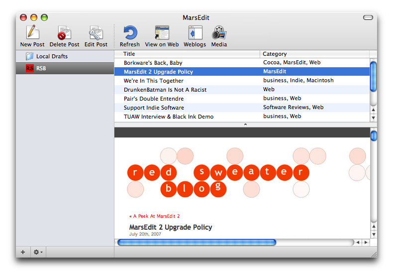
Of course, I already showed off the post editor a month ago, but it’s come a good deal further since then. Again, just look at the icons!

What I can’t really express with a picture is how much fun it is to just show and hide the options side-panel. I love the tactile feeling of the animation as the text scrunches up or expands to fill the space. I could just open and close the options pane all day. Except of course, then I’d never ship this thing.


August 24th, 2007 at 1:39 pm
Looks really nice. Nice job ;-)
August 24th, 2007 at 1:52 pm
missing a search field, which was already lacking in the actual version. Where it is? It’s essential to search in the posts…
August 24th, 2007 at 1:55 pm
Wiping the drool off my keyboard…
August 24th, 2007 at 1:55 pm
Reinard: it’s high on the TODO list, but didn’t make it for 2.0.
August 24th, 2007 at 1:56 pm
Cool, looking forward to it.
August 24th, 2007 at 2:00 pm
Seems like a big improvement; I’m looking forward to it.
August 24th, 2007 at 2:00 pm
That’s purdy. Can’t wait to add an upgrade to your bottom line.
August 24th, 2007 at 2:04 pm
Looks nice. I really really hope it has a “Save Drafts on Server”-Feature. Does it?
August 24th, 2007 at 2:23 pm
“What I can”™t really express with a picture is how much fun it is to just show and hide the options side-panel. I love the tactile feeling of the animation as the text scrunches up or expands to fill the space. I could just open and close the options pane all day. Except of course, then I”™d never ship this thing.”
If all animations don’t move in slo-mo when you hold down the Shift Key, I will be sorely disappointed in you, Daniel.
In fact, I think I’m on solid ground in saying that this is the single most important feature users are anticipating in v2.0.
August 24th, 2007 at 2:24 pm
Wow. It looks really, really great. I can’t wait to give it a try!
August 24th, 2007 at 2:29 pm
Chucky: Heh. I am afraid I might disappoint in that regard. After all, you have to hold down shift to invoke the keyboard shortcut!
August 24th, 2007 at 2:41 pm
You’re a tease Daniel – but I can’t wait. You put a huge amount of work in this upgrade. Thanks.
August 24th, 2007 at 3:03 pm
Good job – but looks like ecto to me !
August 24th, 2007 at 3:20 pm
Fantastic work as ever, Dan! May I ask the “financial implications” of upgrading?
Thanks!
August 24th, 2007 at 4:26 pm
Ignore previous question – I’m too silly to remember previous posts.
/me refills glass.
August 24th, 2007 at 4:40 pm
Will ME2 be Leopard-only?
August 24th, 2007 at 4:52 pm
Can’t wait to try it out!
August 24th, 2007 at 5:16 pm
Lookin’ sharp!
August 24th, 2007 at 5:50 pm
Oh I can’t wait!!! How much?! How much?!
August 24th, 2007 at 8:28 pm
Lookin’ good! I’m glad to have been able to participate as a Beta tester!
August 24th, 2007 at 9:09 pm
Stubblechin: ME2 will be 10.4 and later. It’s coming out before Leopard, I promise :)
August 25th, 2007 at 1:35 am
Looks great! Can’t wait to put my hands on it… :)
August 25th, 2007 at 2:50 pm
Great work Daniel, I might end up using it :-)
August 27th, 2007 at 4:14 am
This looks rediculously nice, Daniel – going from an icon designer, I think the ‘media’ icon is quite eye-catching and daring, I like it a lot. Otherwise, the icons, as you said, progressed a lot in terms of overall sharpness. The only thing that in my opinion seems to stand out is the ‘send to weblog’ icon, which seems a bit strange – the globe is actually larger than the article, and it doesn’t really convey and metaphor for ‘uploading’ content.
Otherwise, looks very sweet! I can’t wait :)
September 2nd, 2007 at 3:10 am
Looks great
Will it support Tags (e.g. in Movable Type), or just the keyword/Tag hack that the current version supports.
– Mitra
September 2nd, 2007 at 10:19 am
Mitra – native tags are not yet supported, but it’s definitely high on my priorities list.
September 3rd, 2007 at 12:39 pm
Looks a lot like ecto :)