FlexTime 1.1a1
October 19th, 2006One of the most common requests from FlexTime users is that the elapsed and remaining time for routines should be displayed in a more easily readable form then as a teeny pie-chart. So I’ve been planning to add some additional UI to reflect this information while a routine is running.
But I’m sort of blocked on how to do it right. I thought I’d use the unused real-estate in the “Activity Is Running” details pane, but it was hard to find a good compromise between “so big that it dominates the section” and “too small to be guaranteed easily readable.”
So I need some feedback. If you care about this feature I’m hoping you’ll try FlexTime 1.1a1 and report back with your observations. Ideally you’ll be so inspired that you’ll come up with a mock-up image of how you think the information should be conveyed.
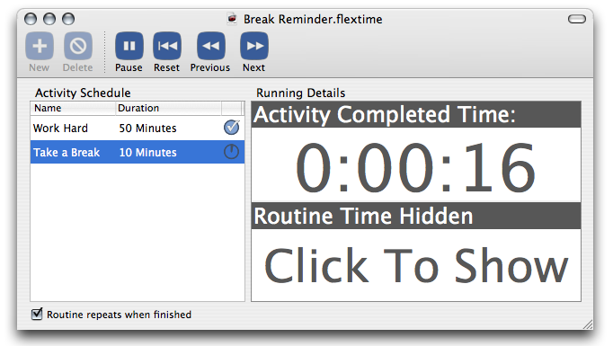
For the time being I’ve decided to GO BIG and make the feature as useful as possible to those who have been patiently waiting for something. So while you’re running a routine in FlexTime 1.1a1, you’ll bold graphical feedback:

Note that the top portion reflects just the current activity, while the bottom portion reflects the entire routine. Click either one to adjust whether it shows the completed time, remaining time, or just stays quiet. If you save the document after clicking, it will stick with the document when you reopen it.
I really doubt this will be the final UI for this feature, but I need some inspiration before I can finish it up. Thanks for trying it out and sharing your comments!
NOTE: I’ve only made the UI changes in the English localization, so if you’re using German you won’t see the changes unless you turn off the German localization for the app.


October 19th, 2006 at 1:59 pm
Why ot make the vertical splitter dragable (If it isn’t already, haven’t tried your app) and rescale the right hand side accordingly?
October 19th, 2006 at 2:00 pm
Hi Jeroen: that’s a possibility. The main reason right now is that the other UI that lives in that part of the screen while the routine is not running, it’s not resilient to being resized. But that is certainly something I could look into.
October 19th, 2006 at 2:10 pm
I see, this would mean the right hand side is fixed in size in some way and other size is taken bij the left hand side.
*If* the right hand side is to stay fixed then it would imply that it is best to show the time display at another area in the UI. I don’t know your opinion on drawers: perhaps a drawer that drops down from the bottom of your app?
Or an optional time display in the bottom part of the left hand side. Just some ideas. Couldn’t find anything conclusive in Jenifer Tidwell’s Designing Interfaces (great UI design pattern book ISBN 0-596-00803-1).
October 19th, 2006 at 2:41 pm
Your gadget reminded me of an old productivity research story I read many years ago.
I read about how some efficiency experts were trying to measure the amount of time executives spent on each task during their work day. They couldn’t do continuous monitoring, as their work behavior would be affected (perhaps even subconsciously) by them realizing they were being watched.
So they decided on a statistical approach. They gave executives a little box with electronics that beeped every 15 minutes, and asked them to write down in a diary what they were doing when the beeper went off. Being thorough statisticians, they tried various timed approaches, like random intervals. General productivity was measured with the usual office metrics, like total work generated, time spent on completion of routine, fixed tasks, etc. Productivity was measured before the beepers were issued, as a control.
What they found was surprising. As soon as they started issuing the beepers, productivity rose immediately. The statisticians despaired, the measurements were altered by the measurers. They tried to eliminate this as a factor, or else their study would provide no useful results.
But then they finally realized what was happening. Whenever the beeper went off, the execs wrote down what they were doing, which might have been daydreaming or sipping coffee or whatever, but then they were jolted into a productive task (writing in the journal) and then they WENT BACK TO WORK.
After the study was completed, some of the executives begged the statisticians to keep their beepers. They said it was just the sort of productivity booster they needed, it would nudge them every once in a while to quit loafing and get to work.
October 19th, 2006 at 2:45 pm
Charles: Interesting story! Maybe I’ll write a scripted cue that simply asks the user what they’re doing, and stores it in a text file. That wat you know you’re getting recorded and can’t lie :)
October 19th, 2006 at 3:31 pm
Well, you could probably just create a randomly timed popup that says “Hey get back to work!!” and it would be just as effective.
October 20th, 2006 at 10:12 am
Yeah! Charles, I need just something like that. I tried post-itting a “keep going” note behind my display and I added that line to my desktop background, but all I do is not to look at the reminders. I’ll give the random beeps a try. Thanks for sharing! :-)
Jan
—