FlexTime 1.1
November 1st, 2006FlexTime 1.1 was released today. Check it out!
Summary of changes
- Major UI renovation. More compact presentation and an updated appearance.
- Added large elapsed/remaining timer UI while routine is running.
- Added an automatic software update feature.
- Removed German localization. Focusing on features without localization for now.
- Fix a bug that caused weird behavior when recent documents were deleted.
This release has a markedly different (improved, I’d say) interface, that was inspired in large part by the HIG speech that John Gruber delivered at C4.
Update: It was pointed out in the comments that I should include a picture of the old interface for those who weren’t familiar with it:
I’m sure there will be people who both love and loathe the new look, but I think it’s important that the new interface is more compact and has a lot more contrast than the old one. I am hoping this more refined look will invite new users to give it more of a chance before quitting it and moving on.
FlexTime 1.1 also includes the afore-mentioned “large timer feedback” while running, and includes Sparkle-Plus for automatic software update checks.


November 1st, 2006 at 8:49 am
I’m very pleased with the changes. The colours look good and I REALLY like the activity and routine timers. A great update!
November 1st, 2006 at 9:20 am
I’d say it looks good. I am downloading it right now.
Let’s see what’s new and improved.
November 1st, 2006 at 9:22 am
Now that’s a heck of an update! It looks great. on small thing: the light source for the toolbar buttons is top-left, whereas the light source for everything else is the OS X HIG standard top. So they look a little out of place.
You know what they say: when the worst complaint is the icons, you’ve done a really good job.
November 1st, 2006 at 11:02 am
Scott: Maybe the contrasting light sources add to the interest level.
November 1st, 2006 at 12:54 pm
Now that’s a handsome app! I really like the new look. Nice job.
Three cheers for making your own HIG!
-systemsboy
November 1st, 2006 at 1:45 pm
Nice update! Putting her through a test-run right now, especially with the included Procrastination Hack routine.
One request for the next version though. You can set a sound to play at the end of an event. It’d be nice if you could control the volume of that sound, since it tends to get drowned by iTunes.
November 1st, 2006 at 1:47 pm
Tim: thanks, I will add that suggestion to the list. I’m thinking that FlexTime’s cues will probably move towards a “more configuration options” UI, where things like that would be a natural fit. As it is right now I’m sort of stuck with a minimalist “cue type” and “cue parameter” approach.
November 1st, 2006 at 2:05 pm
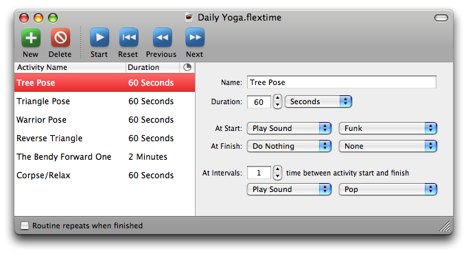
The Bendy Forward One?
November 1st, 2006 at 3:03 pm
Great update.
The highlight color on the left space (in the screenshot above, red) corresponds to the setting in Appearance, right? I’ve been using Green, and found that the very top left word (the closest word to “A” in Activity Name) is a little hard to read.
Anyway, I’m super-glad to know that you could “Fix a bug that caused weird behavior when recent documents were deleted.”! That was really weird, eh?
November 1st, 2006 at 3:47 pm
Scott: Heh. The pose has some long Sanskrit name or something. Hey – that’s a real FlexTime document from my private collection!
Takaaki: Yeah the highlight color is based on the user’s preference. It’s directly from Omni’s frameworks. Thanks, Omni!
And yeah, that was a weird bug. I’m really glad you found it, Takaaki!
November 1st, 2006 at 3:54 pm
What did the UI look like before?
November 1st, 2006 at 4:02 pm
Here is a screenshot from the old UI:
http://www.red-sweater.com/blog/images/FlexTime1.0.png
November 1st, 2006 at 5:49 pm
Comparing the two versions (you might want to include both in your post), you can see that 1.1 is much improved. You’ve given me some ideas with regards to my own in-development application, which is looking a bit bland at the moment (similar to your 1.0).
Are there any slides or detailed notes from John Gruber’s presentation at C4 available? I couldn’t see anything on his or C4’s site.
November 1st, 2006 at 6:00 pm
Nick: i updated it with the old image inline … good idea!
November 1st, 2006 at 6:36 pm
Good idea to show off the improvements in GUI design. I very much like the new one compared to the old one.
The 1.0 version seems to be an inactive window. Do you have an active version?
November 1st, 2006 at 10:29 pm
I really like the update, except that it makes the toolbar seem out of place. It seems like New/Delete would be more natural at the bottom of the activity list. Not sure what I’d do with the rest, although in small size and icon-only, they seem to fit better with the more compact UI.
November 2nd, 2006 at 1:55 am
Great update Daniel. The icing on the cake would be a blog article on how you developed the new UI. For example, how and if there were issues adopting the unified toolbar, the footer, if you needed a custom NSView to colour the right side detail panel, what third-party frameworks you used (just a few Omni frameworks, Sparkle-Plus?). Thanks.
November 2nd, 2006 at 7:57 am
Michael: Actually that is “active” … it’s just that when I took the screenshot, I was in graphite appearance mode. I got stuck there for a while, and forgot about it :)
Dan: In early versions of FlexTime, the new/delete were below the list, but I worried that new users would find it too unintuitive. I sort of like how, especially with the color now, it’s very easy for a new user to figure out how “do something.”
Dale: great idea. I will think about putting together another article to talk a bit about that.
November 2nd, 2006 at 4:00 pm
The icing on the cake would be a blog article on how you developed the new UI
Another vote for that.
November 3rd, 2006 at 6:29 am
First off – great update! I’m trying out the 30 day trial and will most likely buy this program soon. If you don’t mind, just a few things –
– I always use “run script” for opening applications and documents, maybe change this label to something other than ‘run script’ for the sake of new users? it works perfectly for me with everything else
– Would it be possible to have an auto-start on some routines? I have iCal launch one for me every morning. Having that particular routine start as soon as it launches would be a great addition.
– Is there anyway to bypass growl? I have it running, but I would rather use the FlexTime alert that I need to click. Even unchecking ‘FlexTime’ in the growl system preferences doesn’t prevent it from being sent to growl.
– I can’t reproduce this, but I was running a routine, and at the end instead of going back to the ‘set up’ screen, it continued counting down into 00:00:-04 (for example). It continued counting down backwards until I closed the routine and opened back up. I’ll let you know if I can get this to happen again.
– Last thing, as I understand it works now, if I have an action for 20 minutes and 5 intervals set within that, when I pause and then start the action again it re-sets the intervals? Would it be possible for it to remember how many intervals there are left after the pause, and continue running as it did within the 20 minutes, and not just the remaining time? (If this doesn’t make sense – I can clarify)
Sorry if that was a lot – just a few things I noticed! Looking forward to everything for FlexTime in the future! I love it.
November 3rd, 2006 at 7:36 am
Jesse – I appreciate the enthusiasm and the numerous good points. I’m going to respond to each without quoting, to avoid crowding up the place too much :)
– I appreciate that there is a problem with the “Run Script” not being intuitive. I should probably just bite the bullet and add a separate cue type for “Open With Finder” or something. If you’ve got a good idea for a single phrase that means all of the things concisely, please let me know.
– Auto start was suggested by another user, and it’s on my list for possible enhancements. Until then, the best I can suggest is a script that automatically opens and starts a routine. I wrote about this in a previous blog entry.
– You are the first person I’ve found who runs Growl but doesn’t want FlexTime to send to it. I will definitely add something, probably a preference, to allow users to ignore Growl even if it’s present. Unfortunately the Growl interface for programmers doesn’t let us see that the user has unchecked the application. Ideally I’d use that as a cue to resort to the built-in display.
– The negative-running bug sounds very interesting indeed. Do let me know if you spot it again.
– If you just “pause and start” then FlexTime will remember the position into the activity, and it won’t repeat any intervals that have already been passed. But if you reset the routine, or skip backwards to the previous activity, your position is lost. Does that make sense? If not you might need to clarify more what you’re observing.
November 3rd, 2006 at 1:12 pm
Daniel:
Would you consider adding a “Random” option in the “Play sound” drop-down? I use FlexTime to remind me every five minutes to correct my posture and I’m starting to ignore the sound sub-consciously. I’ll change it manually, but I think a random sound option would help to prevent this.
Oh, and nice update! I’m working my way through the 30-day trial and I will most likely buy FlexTime (regardless of your decision to implement the above feature request). Great program!
November 3rd, 2006 at 1:47 pm
Tim: I’m adding the suggestion to my list, and in the mean time I’ve come up with a nifty workaround for you.
November 3rd, 2006 at 2:18 pm
Dude, you rock! You’ve convinced me to register FlexTime. :)
November 3rd, 2006 at 2:38 pm
Excellent – only 5 million Mac users to go :)
November 4th, 2006 at 12:37 am
Daniel! You are excellent my man. These great replies and the fact that you’ve posted twice on your blog since I visited this morning. haha Good stuff. You definitely have me a registerer as well, keep this great support up!
– For some reason, iCal splits this up into two separate commands, “open file” and “open script” – then the ‘open script’ only allows scripts to be chosen in the box. This may be the best solution, or just a simple “open file/app” would cover everything.
– Cool, thanks for that! I’ll incorporate that into my launching script. Awesome.
– Yeah, as far as I know – there’s no way I can set the Growl notification to only dismiss when I click it. That’s what I liked about the FlexTime notification, otherwise I’d totally use Growl.
– I’ll keep a look out for the negative time bug reappearing. As well as anything else, of course.
– OK, Cool. That’s totally what I was talking about. Fixed before I asked for it! :)
Also, if you don’t mind – a few more things? Haha, sorry if this is too much.
– You probably have this on your “to-do” list, but a full screen countdown for the activity/routine would be excellent
– When changing the title of each activity, if the title is too long, it just cuts the next line in half. Would it be possible to have the text automatically get smaller to accommodate the larger title? This is a petty issue, just merely cosmetic – so not that important.
– Also, (and finally :) when changing the duration through the list on the left hand side by double clicking this would be a cool feature; For instance, it’s 2:37, if I typed in 3:12 – it would calculate the difference in minutes then put that as the duration. Just an idea.
Ok, thanks for reading this and keep up the good work!
November 4th, 2006 at 8:40 am
Hi Jesse – more great suggestions. I will have to ruminate on the “open file/script” thing for a bit, but I agree I gotta figure something out to let that feature shine better.
For Growl, if you go into the Growl System Preferences pane, and click on the “Applications” Tab, you’ll see FlexTime in the list. Go down to FlexTime and click it to show the notifications for it. You’ll see just one for the “Show Text” cue. If you click the checkbox for “Sticky” I believe this will make all the messages displayed from FlexTime require a click to dismiss.
A full screen display mode is totally in the works. It would basically zoom the big timers as they are now to fill the entire screen. I’m also considering some kind of themed plugin format for letting users design their own graphical feedback.
For long titles, I think I’ll fix it so it truncates instead of wrapping. I thought about just shrinking the text, but that would lead to text fonts of different sizes, which could look really awkward. Remember that you can resize columns in a FlexTime routine, and then resize the window. When everything looks great like you want it to be forever, choose “Remember Layout” from the Window menu, and then save the document. It will now look just like that when you open it again.
The difference calculation idea is interesting, but probably too confusing for the default behavior. Maybe I will consider supporting some basic math, so if you edit it to say “3:12-2:37” it would put the difference in.
Thanks for your encouragement and postiive feedback. Glad you appreciate the blog and the user/developer interaction here.
November 9th, 2006 at 12:24 am
I like the new design better then the old one, so points for that.
I would like to know you opinion on the following: Why did you choose to put the most important buttons on the part of the “head” of the application that you can collapse (with the oval top right button).
if one does collapse it he cannot do much with the application anymore. Isn’t there a way to turn off the collapsing of the head?
Curious about your point of view.
ps. i gave flextime a spin in its old form, but are not a regular user of it…
November 9th, 2006 at 8:55 am
Hi Ilya – the toolbar buttons are all also available as selections from the “Routine” menu. This is a pretty standard way of presenting functionality in a Mac app, and I wouldn’t want to limit users’ ability to hide the buttons if they don’t use them. Many users will for instance just use the keyboard shortcuts from the menu items to control FlexTime.
November 11th, 2006 at 11:09 am
One suggestion: Change the toolbar buttons. Giving them all the same 3D box reduces the ability to recognize stuff by its outline. Maybe just turn that into a thick colored border around the actual icons or so?
Just a suggestion.
November 30th, 2006 at 11:59 am
OK, I’m late to this comments game, I was reading Dan Benjamin’s blog and that linked here.
Without actually using your software, merely judged by the screenshots, I think your old design was better. I first thought, “Wow, what an improvement!”, but then I realized I had gotten it wrong. The second screenshot is the earlier. D’oh!
I think the colors are too much and distracting. Whereas the old look was tame, professional, elegant, understated and subdued, the new design is a bit on the campy side. Those colorful, shiny buttons cry for attention. Maybe if they were smaller, their exhibitionism would be more forgivable.
There may be more contrast, but what is that contrast needed for? To separate the idle, content-free area from the rest? It only draws attention to the overblown dimensions of the former.
And finally, lack of borders. I know this is an old OS X trend, but it’s one I’ve never agreed with. Just like margins in a book, borders are needed to separate your window contents from the background. It’s simply bad typography to skimp on margins. Even if Apple does that (in apps like Safari or TextEdit, where it’s the most obvious), it won’t make it right. It’s ironic how this all was inspired by a “HIG is dead” speech…
Seeing that everyone likes the app’s new look, I’m sure my criticism won’t make you feel overly bad about your product. If you were asking for my advice (which I noticed you weren’t :)), I’d say, add at least a left margin, and drastically reduce the size of the toolbar. Or make the icons less prominent. Or use that space better, these six left-aligned buttons leave a vast empty space on the right-hand side.
Oh, if I release an application one day, please feel free to give it hell in return… Keep up the great work, including the blog.
December 2nd, 2006 at 5:44 pm
i wonder if someone with red/green colorblindness can distinguish the colors on the new and delete buttons. (i’m not, but have gotten dinged for that sort of thing before.)
December 3rd, 2006 at 9:23 am
Jim: that’s a fair point, but I figure the redundancy of the color with the symbols should probably at least buy me some forgiveness, there. For instance Apple’s “window bubbles” have been criticized because they don’t show the shape until you hover over them. But in this case at least somebody with color blindness could tell them apart by looking at them.