Resolution Independent Fever
November 10th, 2006Resolution independence is the notion that all graphics on a computer display should be zoomable to an arbitrary multiplier without losing quality. If you know even the slightest thing about computer graphics, you’ll understand that in a resolution independent world, bitmaps are out and vector graphics are in. Vector graphics can scale gracefully to an arbitrary resolution, while bitmap graphics inevitably lose quality.
Bitmaps specify a graphical image as a grid of colored dots that, when combined at high enough resolution, may create the illusion of a photorealistic image, or a smoothly curved contour. For the time being, we’re stuck with grids of pixels, because that’s how our monitors and (most) printers work. Over the course of computer history, bitmap graphics have gotten larger to accommodate increasing display resolutions. For instance, icons “looked fine” in Mac System 7 at 32 by 32 pixels, because most monitors were not more than 640 by 480. As monitor sizes grow, the standard sizes for icons and other graphics grow along with them. Suddenly the System 7 icon looks like crap when forced to participate in this modern world:

So, MarsEdit pretty, Resorcerer ugly, right? For now, anyway. Time marches on, and one day we’re sure to find ourselves struggling to appreciate the relatively low resolution of the MarsEdit icon, too. Look what happens if we quadruple the resolution (caveat, this is from the screen capture, not necessarily from the highest quality available in the MarsEdit bundle):

Suddenly the cracks are beginning to show. So what’s the big deal? Can’t we just continue to improve image quality as resolutions increase? We could, except that the limits of resolution are about to be completely blown away. Resolution independence will debut as a user-level feature in Mac OS X (and Windows Vista, as I understand it) giving users the ability to choose the resolution at which they wish to view any graphics on their screen. Apple has a few documents on this that are worth reviewing
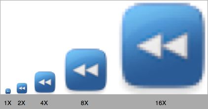
What this means for developers is that every piece of bitmap graphics in your application is now liable to be zoomed to such a degree that it looks like ass. How much like ass? You can get a sneak peek at how well your graphics survive resolution independence by using a little-known feature of the Quartz Debug application (part of developer tools). Select “Show User Interface Resolution” from the Tools menu to see the following window:
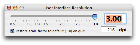
You’ll have to quit and relaunch your application to see it at the zoomed level. Now that you know how bad the problem is, what’s the solution? In order to prevent our graphics looking like ass, they themselves need to be resolution independent. This means they either need to be drawn on the fly, or created and saved in a vector-based format. Ugh! Lots of work. The good news is that lots of designers have been using vector-based art for their work for some time, and can probably accommodate the changes pretty easily. But if you’re a cheap hack like me, you’ve probably got lots of bitmaps around that will need to be revised.
Peter Hosey noticed one such cheap bitmap in FlexTime 1.1: the new pie-chart table header cell. It looks fine at 12×12 pixels, but let’s see what happens when resolution independence takes its toll:
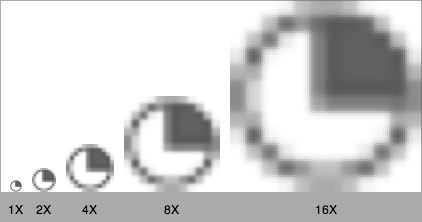
Yikes! Peter was nice enough to send along a solution, which was a small EPS source file that, when compiled into PDF, made a fast and resolution-independent graphic resource for my product. The only problem was I had some minor qualms with the exact size of the pie-wedge, and wasn’t comfortable enough in PostScript to easily make (or maintain) the changes. What the heck, I thought, why not do this programatically from Cocoa? I can use NSBezierPath to draw vector scaleable graphics on-the-fly at any resolution. I discovered, with Paul Kim’s help, that NSCustomImageRep would allow me to both do all the drawing on the fly, and take advantage of the conveniences of NSImage, such as being able to “setImage” on a table header cell. Let’s see how my pie icon survives zooming now:
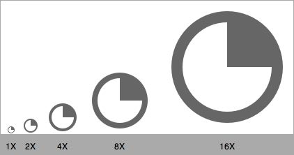
Wow! That’s pretty cool. I thought this technique for “resolution independent generated images” would be useful for others, so I thought I’d share some code. But surely you’d have no use for a quarter-filled pie. Let’s see, what would be truly useful. A piece of reusable code that will last through the decades, and never turn stale. I know! A little yellow guy!
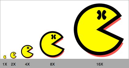
LittleYellowGuy contains an example application and Xcode project, demonstrating the creation of an NSImage that draws itself at full resolution for whatever size it’s set to. This code is available to you under the MIT license.
Now that my pies and little yellow guys are in order, I can turn my attention to the other vulnerabilities in my interface. Those brand-spanking-new toolbar icons I just designed using PhotoShop? Even they are not ready for 2006.
But at least my pie looks good.
Update (Nov 19): This article has inspired a great deal of discussion not only in the comments below but among other blogs. It seems people haev a lot to say about this subject! Many reactions point out that a single vector-based graphic is not likely to look great at all resolutions. Fine-tuning at the pixel level will remain a requirement. I hadn’t really considered this, but it makes a lot of sense. Ample payback for the time I spent writing this article!
Some of the most substantial reactions are linked to here:
Sven-S. Porst
Jasper Hauser
Craig Hockenberry
Christopher Lloyd
Stephen Deken
Marc Edwards


November 10th, 2006 at 10:51 am
(Moving our IRC conversation into your comments so the entire world can reap the benefits of our wisdom)
Backing up to the original problem of “how do i use resolution independent images in my app?” the right answer to me is to use a resolution independent file format. And in Cocoa that basically means PDFs (I might have support for SVGs one day…)
Both your piechart and the pacman icons could have been saved as PDFs and used in a Cocoa app anywhere that an NSImage could be used with zero lines of code. Instead of creating a custom NSCustomImageRep and creating your image via Cocoa/Quartz calls you should IMHO be using Illustrator or Lineform to create your images and then just handing a PDF file to NSImage.
Resolution independence with zero lines of code?
November 10th, 2006 at 10:55 am
I agree with Jonathan. As a Java developer, I spend a *lot* of time writing code for resolution independant graphics and if I could easily get away with PDF and/or SVG, I would do it right away (well, you can do SVG quite easily in fact.) I was recently quite pleased by another Java developer who wrote a SVG to Java converter. I bet something like this could be done for Cocoa/Quartz since the drawing primitives are also very close to SVG.
November 10th, 2006 at 11:00 am
You make a good argument for my not using a programatically generated pie chart icon here. For whatever reason (probably because I was “porting” Peter Hosey’s EPS code), I ended up doing it that way. Maybe I’ll switch to a PDF file before I ship it. But if for instance I required a different wedge size (pie cutout) in different instances, it would tip the scales in favor of generated graphics. I figure there are realistic scenarios out there where an NSImage needs to be programatically generated, and that some developers would appreciate seeing how it could be done.
The “save as a PDF from Illustrator” process doesn’t need nearly so much explanation.
November 10th, 2006 at 11:13 am
LineForm did a decent job with the wedge:
LineForm original (zipped)
PDF
PDF (Shrunk to 95% original size using PDF Shrink
November 10th, 2006 at 11:17 am
Thanks, Jon. The PDF looks good to me.
November 10th, 2006 at 11:19 am
Romain Guy: Yeah SVG is definitely superior to PDF for something like this. I’ve worked on a standalone SVG framework for Cocoa called “PettySVG” the idea was to use SVG-Tiny images as resolution independent icons.
PDF does have some issues, from a PDF expert “smart friend” of mine: “the danger with supporting generic pdf for icons, say over svg, is the real chance that someone will try to use a 20MB PDF as an icon or say a 40KB PDF that has 300 smooth shades, you also have the issue of fonts inside PDF and antialiased rendering”.
November 10th, 2006 at 11:48 am
Personally I prefer doing it all programmatically (where technically feasible).
In some cases it can be beneficial to go the programmable route vs. the PDF route. Not least if you have artwork that contains text strings, and you localise your software to 20 languages it means you don’t need 20 different versions of each PDF used in your GUI (which contributes to you hitting / exceeding your bandwidth limit when people are downloading this bigger dmg image).
Instead you can programmatically draw the icon / glyph / etc. once, and have a localised string file, with the different language versions of the text that needs sticking in the artwork. Then in your programmable code you can get the correct localised string for the button / whatever (as per standard localisation methods), and draw that word in the artwork.
Of course you could do the same with a PDF containing the artwork, and then superimpose the text from a strings file on top of it, but this doesn’t let you mix the artwork and text quite as flexibly. If you’re going programmable, you can stick the text at the correct stage of the drawing rather than just ‘before the PDF gets drawn’ or ‘after the PDF gets drawn’.
November 10th, 2006 at 12:12 pm
Excellent work Daniel; now I don’t have to make a new resolution independent icon for Gamepedia I can just use Little Yellow Guy.
November 10th, 2006 at 12:17 pm
Conor: Hah! Of course, that’s the one instance where (I assume) generated graphics are useless, since the Finder needs an icon file.
November 10th, 2006 at 12:20 pm
The Boy Ken: Programatic icons? Unless your app is a special case (who knows, it could be) then shouldn’t a graphic designer be doing the artwork? Hard coding the graphics in the code seems like a maintenance nightmare.
PDF isn’t well suited for this (we’ve already discussed the merits of SVG), especially for something like text – who’s to say the end user will have the right fonts on their machine.
And of course as you point out Localisation is an issue. You can have multiple layers inside a PDF (one for each localisation) and show/hide layers appropriately. PDF/X-4 will allow you to tag layers as translation to somewhat automate this process.
You can also get around it by using SVG by running it through an XSLT transform (I just know i am going to ribbed for that) or via one of a host of other methods.
November 10th, 2006 at 12:38 pm
Does the resolution independence apply to desktop icons as well?
If so, it’s time for all of us icon designers to brush up on Illustrator right quick. I for one find Photoshop the ideal environment to design icons but am still excited about the possibility of scaling icons up to insane sizes on screen.
November 10th, 2006 at 1:28 pm
Steven, your icons should be 512×512 to be consistent with the new Leopard icons.
Keep in mind, guys, any images that can’t be properly rendered as vector, should just be made in high enough resolution that they don’t look pixelated when scaled up in Quartz Debug.
November 10th, 2006 at 3:24 pm
Looking even farther ahead, simply scaling vector graphics is not the right answer all the time. (Good) font designers don’t just make a larger or smaller slug with exactly the same image. They adjust the thickness of strokes or pay attention to how the printing/display technology modifies their shapes. (Offset printing, for instance, tends to fill in acute angles, so font designers used to subtract ink from such angles, so the letter form would look good when it gets filled it.)
It’s not too hard to imagine “low” resolution vector graphics that leave out small details because they’ll just look muddy. The red shadow on your LittleYellowGuy leaves just a tiny fringe at low resolution: maybe it should be dropped when resolution gets too low. Blow up a vector-drawn MarsEdit icon to a huge number of pixels and it’ll look dull with its huge swathes of fairly flat color; where are the rivets? The hull decals?
I’m not in on any sneak previews so I have no NDA to worry about here. I hope Apple is looing far enough ahead to do now with vector graphic images what they did yesteryear with icons: allow the designer to provide different graphics for specific resolution ranges. (I hope we can safely ignore the issues with printing/display technology and just assume one representation is fine for all of them.)
November 10th, 2006 at 4:00 pm
“one instance where…generated graphics are useless”: I am bamboozled at every step; maybe I’ll get some free code that I can actually use in your next blog post. :)
November 10th, 2006 at 4:47 pm
Hmm… I think that we need a new format. One that combines the scalability, portability, and compactness of SVG, but adds support for dynamic resolution-based tweaking and pixel-based effects that are calculated on the fly (i.e, with Core Image filters). Also included should be programmatic properties; i.e, you could say -in this case, imagine the iPhoto icon- [icon setBarrelExtension:2.0] and the icon would now draw with it’s embedded formulas drawing the barrel of the camera down 2 units (whatever 2 units means in that context). Opens the door to animation, too…
This would need to be supported by a new drawing program, too…
November 10th, 2006 at 9:07 pm
Bret, look (deeper) into SVG. It can basically do everything you just described.
You can use JS (not optimal but available) to modify the SVG DOM tree on the fly. And it supports extensible special effects (which could very well be implemented via CoreImage).
November 11th, 2006 at 4:03 am
Ken: a reasonable PDFKit would let you insert arbitrary code into the PDF stream so that the problem disappears. But then, a reasonable WindowServer would let you insert arbitrary postscript anywhere you could draw to the screen (or indeed, anywhere) so that in either case, the localised text ends up just being a layer which gets inserted at some level of the image.
November 11th, 2006 at 7:17 am
We used to have a solution to this problem, it was called pswrap, but Apple dropped it when they dropped display postscript for core graphics. You could write postscript code directly in your source file. The postscript could be parameterised too, so you could support internationalisation without too much hassle. The postscript was extracted by a preprocessor as part of the compilation process. It worked really well, it’s a lot nicer writing clean postscript for drawing code than doing it as C function calls (or Objective-C). And it is much more readable.
I wonder if something like this could be bought back?
November 11th, 2006 at 12:10 pm
Nice write-up and description of the problem.
This is definately becoming a key area developers need to prepare for.
One note. I also immediately thought of converting low resolution bitmap graphics to vector based graphics as being the best solution. Obviously, with the unlimited scaling potential, and coming from an engineering perspective, seemed like a no-brainer to me. But, in reality, after speaking with designers, they have a different opinion. In general the advice from designers has been that vector based graphics are great for single, or few, color images, but bitmap graphis are superior for artwork. I suppose I can see the point when dealing with photos and photo-realistic artwork. In these cases I’d recommend multi-representation tiffs. Iconfactory has a new version of IconBuilder available to help with the Resolution Independence work as well.
November 11th, 2006 at 4:23 pm
Those of us who like to cheat and use 2D impostors for 3D objects get to be a little more careful these days as well.
November 11th, 2006 at 6:30 pm
Why do you use NSCustomImageRep? You can simply draw your bezier path into a locked NSImage image that is sized to the correct point sizing for the path you are drawing. Internally NSImage will scale your point sizing by the current UI scale factor and allocate an image rep with the required number of pixels and you path drawing will automatically be scaled by the current UI scaling factor.
For example the same simple code results in the following images when at 3x, 2x, and 1x UI scaling (note the number of pixels changes)… no need to play around with image reps… NSImage will do the right thing for you.
NSImage* image = [[NSImage alloc] initWithSize:NSMakeSize(72, 72)];
[image lockFocus];
[penBody fill];
[penBody stroke];
[image unlockFocus];
2006-11-11 17:20:13.441 SimpleResolutionArt[1855] NSImage 0x35bd40 Size={72, 72} Reps=(
NSCachedImageRep 0x35bc60 Size={72, 72} ColorSpace=NSCalibratedRGBColorSpace BPS=8 Pixels=216×216 Alpha=YES
)
2006-11-11 17:20:41.557 SimpleResolutionArt[1859] NSImage 0x35aba0 Size={72, 72} Reps=(
NSCachedImageRep 0x35a9a0 Size={72, 72} ColorSpace=NSCalibratedRGBColorSpace BPS=8 Pixels=144×144 Alpha=YES
)
2006-11-11 17:21:01.692 SimpleResolutionArt[1861] NSImage 0x359250 Size={72, 72} Reps=(
NSCachedImageRep 0x34dc70 Size={72, 72} ColorSpace=NSCalibratedRGBColorSpace BPS=8 Pixels=72×72 Alpha=YES
)
November 11th, 2006 at 6:40 pm
I put together a quick example for my prior post (note the “pen” code is from a larger project pulled into this example so I didn’t have to craft anything new). Try it out with various UI resolution settings.
Source:SimpleResolutionArt.zip
November 11th, 2006 at 6:41 pm
Shawn: I expected NSImage to do this for me, but I found that instead it was scaling the cached image rep instead of regenerating from the original paths. Perhaps there was some subtle problem in my use of the API? I got the impression that once I “filled” and “stroked” into an NSImage, they were turned to bitmap format and thus lost their resolution independence.
November 11th, 2006 at 6:47 pm
Shawn: Thanks for posting your sample project. It gives me a good context in which to explain the problem I’m trying to overcome. Your image exhibits the same degradation when zoomed to a larger size. For example, comment out the “for loop” in your drawing routine, and add this instead:
[pen setScalesWhenResized:YES];
[pen setSize:bounds.size];
sourceRect.size = bounds.size;
[pen drawAtPoint:NSMakePoint(0,0)
fromRect:sourceRect
operation:NSCompositeSourceOver
fraction:1.0];
You’ll see that your image is not resolution independent, either. Or am I missing something?
November 11th, 2006 at 8:10 pm
Scaling the image after the fact is a different issue, one independent of UI scaling.
In my example an NSImage instance is created at the correct DPI for the current UI scaling factor which includes allocating a backing pixel based image rep with the correct pixel dimension and of course the path is rendered into this image rep with a transform that includes the current UI scaling (path is scaled before it is rendered into pixels). Basically you have an NSImage instance optimized for rapid screen display (pixel based and in the correct color space) with the appropriate fidelity for the current UI scaling factor.
If you go an scale this image after the fact for other reason you would of course be scaling a pixel based image… but it was rendered with the current UI scale factor considered so no additional scaling should be needed.
November 11th, 2006 at 8:32 pm
…as a following up… what you do in your example is going beyond what you need to do if you want to generate DPI appropriate images at runtime from a bezier paths. Your example allows an image to be back by bezier paths and not pixels which has it advantages but you don’t need to go that far for common uses of such art work.
Note your example has performance implications since the image is being rendered over and over again from the path (happens after every time you change the images size… review NSImage caching policies). So if all you need is art at the correct DPI for the UI scaling factor your application is running under you don’t really need it to be re-rendered again and again, it can be rendered once at the correct DPI and then displayed rapidly after that.
November 11th, 2006 at 11:28 pm
Shawn: Ah yes, I see your point. Your approach is realistic in that we can always guess what resolution the real world actually wants us to present. That’s much more likely to be the case at any point in the future. ssp makes a good point, recognizing that pixel-perfection is probably always going to be appreciated, so probably your position that targeting a specific DPI is best is also well-founded.
November 11th, 2006 at 11:55 pm
What was wrong with the original icon? It looks the same as the revised version to me.
And I’m happy to work with you on improving the EPS version. All you have to do is ask. :)
November 12th, 2006 at 7:50 am
Peter: haha! Originally I wanted to tweak it so that the grey corner wedge was slightly larger. It seemed to not take up the whole quarter the way my orginal did. But now that I look at what I finally ended up with, I agree it’s exactly the same as your EPS. Well, I guess maybe I should have stayed with it after all :)
November 12th, 2006 at 8:26 pm
A lot of this mirrors the world of fonts. As was touched on by another comment, fonts have hints to adjust the letterforms at different sizes. I’m not sure if this is still the case with fonts nowadays (haven’t been keeping up with font technology) but fonts would have bitmap versions for the smaller sizes for screen use. In the end, you can’t beat a hand-tuned bitmap.
If high resolution displays become the norm, I could see hand-tuned bitmaps at different sizes being less common which in some ways is a boon for the graphics creators as it is a bit of a maintenance hassle. Until then, though, a hybrid approach is probably the best we can do.
This link came up on digg recently which basically talks about generating textures procedurally. Also look up “kkrieger” for a playable game solely using generated textures (I believe it’s only 98k in size). While promising in some respects you have to realize that textures don’t need to hold up to the same amount of scrutiny that an icon does. Textures should be a bit random and exact pixel placement is not an issue. Nonetheless, interesting to read about.
November 13th, 2006 at 2:51 am
Rendering the NSImage for the icon once at startup with the correct UI-Scalefactor may be a problem in the future: I would expect that the UI scaling factor may change during runtime of the app (e.g. to implement zooming effects for Expose, the new Pager, etc.)
November 13th, 2006 at 1:25 pm
You can re-render when you get a notification of scaling factor change (in my example just release and nil out the cache) which will only happen when the user adjusts the scaling factor themselves (at least as implied by Apple)…. and that assumes Apple even makes the scaling factor a user level setting, they may just key it off of monitor information (however I expect it will be user settable).
Also I doubt Apple will leverage UI scaling factor for things like Exposé anytime soon since having application redraw themselves when Exposé (or Spaces) is fired up has huge performance and blocking implications. Exposé/Spaces are meant to be fast and light weight.
November 13th, 2006 at 3:01 pm
Hi Daniel! We posted some additional information on our website:
http://iconfactory.com/home/permalink/1731
November 14th, 2006 at 3:20 am
Since Apple eschewed SVG in favor of their own vector definition in Keynote/Pages/iWeb, is it also likely that they may be headed that way with the interface? As it’s been pointed out, PDF works well, but is not suited to the task and there’s already two low cost apps that easily convert PDF vectors to editable paths; one for export to SVG (http://www.purgatorydesign.com/Intaglio/) that can then be made into a Keynote file using svg2key and one that exports directly to a Keynote 1 file (http://www.eazydraw.com/) which indicates it’s not a TREMENDOUS task for simple-ish drawings.
November 14th, 2006 at 12:59 pm
Thanks, Craig. I appreciate hearing your comments. I’ve added a link to the end of the article, as well.
November 17th, 2006 at 1:06 pm
I forgot about one other way to do some images: Unicode symbol characters. In the specific case of the pie-chart, “˜â—””™ would do what you want.
Downsides:
Not every image can be represented this way, obviously.
You can’t always change the font size and color. The pie-chart is one such case: You can’t change the font and color of a table header (at least, not in IB).
If you feel like browsing the Unicode rolls to look for useful characters, the best way to do that is with UnicodeChecker. You may recognize that domain; that’s where Sven-S. Porst’s blog is located. He’s one of the people who replied to your post. :)
November 19th, 2006 at 7:17 am
Hi Daniel, thanks for being the catalyst for some very interesting discussion.
I’ve added some of my thoughts here: http://islayer.com/blog/?p=87
November 19th, 2006 at 8:08 am
Hi Marc – thanks for writing that. Great points – especially about “vectors are easy to botch” – boy don’t I know it :)
November 19th, 2006 at 6:48 pm
At the risk of splitting those for and against into “us” and “them”… it seems like everyone’s opinion falls neatly in to two categories.
#1 – Pro vectors = developers who love the idea of having one file that works for any situation and is completely future proof.
#2 – Pro bitmaps = designers who have actually worked with vectors and realise what a complete abortion the process can be at times!
Obviously Craig Hockenberry doesn’t fit into that sweeping generalisation. I like to think of Craig as a “designer sympathiser” :P
Seriously folks, vectors are trouble! YOU HAVE BEEN WARNED!!!!
November 20th, 2006 at 1:54 am
Adding to Marc’s “two categories” comment, I’d like to enter a third.
#3 Pro multi-image = people who program *and* work with graphics.
Avoid the problem of trying to force things into a false dichotomy. SVG 1.2 though still in final wrap up phases, has added a “multiImage” element. This allows for all or parts of a single file to be matched by DPI, much as game textures use level of detail to swap in versions.
This will allow a designer to create vector versions for higher res icons, but still targeted to size ranges. For example, an icon might render as a single letter at smaller sizes, but a complex image with multiple parts at a larget size.
Also, the smaller size versions could drop to pure bitmap and allow for all the hand-tweaking that icon authors usually need.
Even if SVG render support for this is not widely adopted, it is still a useful solution. Inkscape ( http://www.inkscape.org/ ) is one of the more popular SVG editors and has been adding various icon support features. Even if target platforms don’t support SVG with multiImage, an artist could use Inkscape to work in a single file for all versions and then batch export needed vector or bitmaps for final format.
November 20th, 2006 at 5:51 am
Jon: I hope my post came across as tongue-in-cheek… that was the intention :)
I agree though. A file format like ICNS that can handle vectors would solve everything and be a welcome addition to any developer or designer’s toolset.
November 22nd, 2006 at 9:35 pm
Great article! I am still wondering though if RI will finally solve the tiny font problem used in so many MAC applications?
Will I be able to change the font size system-wide?
November 26th, 2006 at 10:12 pm
“Will I be able to change the font size system-wide?”
I can’t answer that, but you will be able to change the entire UI scale, which will increase the size of everything, including fonts.
November 28th, 2006 at 7:48 am
“.. but you will be able to change the entire UI scale, which will increase the size of everything, including fonts.”
Wouldn’t this be the same as the current zoom feature, resulting in the edges of the zoomed screen to be hidden? If yes, it is not a good solution for the font size problem.
December 9th, 2006 at 4:44 pm
No, zoom enlarges a section of the screen to fill the screen. The UI scale makes all the objects on the screen (menu bar, menus, windows, controls, text) bigger.
December 27th, 2006 at 6:31 pm
what about java apps. Are the going to be left behind. Is this just cocoa thing or will the Java boys be able to play zoom zoom too?
January 19th, 2007 at 5:48 am
I have noticed a lot of discussion about why having an entirely vector interface would be a bad idea. For example at small icon sizes, where handplaced pixels are more eloquent than interpolated ones.
It is very rash to take this black and white approach and imagine taking place a transition from bitmaps’ pros and cons to vectors’ pros and cons. The reality will likely turn out to be the best of both. Small icon sizes do not need to be appear at multi-megapixel sizes, and it would be redundant to allow them to.
Also, this discussion does not have a large impact on Mac OS X Icons either. They have been resolution independent since OS X was introduced. And they bring a relevant hint as to the future of things to come. Namely, for large sizes the icon is interpolated on the fly; when the icon is shown smaller the system uses a set versions of the icon tailored for use at that size.