I have been happily using WordPress as the infrastructure for this blog since its inception, almost one year ago. Since I’m perhaps slightly geekier than than the average WordPress customer, I have been wanting to get to know the sources a bit better and possibly make my own tweaks or write plugins to suit my particular needs. I also like to keep up to date with the latest versions of the software. The problem is that these activities are at odds with each other. See, if you don’t tweak anything, updating is a simple matter of “un-tarring” the package file over your existing installation and visiting the “update.php” URL. But if you’ve made any sneaky changes, you’re liable to overwrite them when you clobber a source file with the updated version.
This situation has led me to an unfortunate state of moaning about having to install WordPress updates. This is bad, because often the small updates contain security fixes, which are exactly the kind of thing I should want to install immediately. Furthermore, I’d like to stop editing WordPress with vi on the server, and searching the source base with grep. I’m proficient with these tools, but I have a Mac! It’s better at such things.
I need absolute WordPress control. Specifically, I need to be able to:
- Install WordPress updates with ease and confidence.
- Hack on WordPress and test results on my Mac before updating the live blog.
- Do so in a way that meshes with my regular work habits.
How do I address this? The problem screams for Subversion and Xcode, so that’s what I will throw at it. By integrating my WordPress hacking with Apple’s Xcode, I can treat the technical underpinnings of my blog just like I would any other code project. I spend so much of my day “building and running” that it’s distracting when any technical project does not fit in with that process.
Step 1: Get Things Under Control
Source control, that is. I decided that I needed a single repository where both my live web site and local Mac could access the same WordPress sources. That means I need an SVN server accessible from both locations, as well as Subversion client tools in each location. Luckily DreamHost comes standard with Subversion support (minor gripe: they’re stuck on version 1.1!). If your web host doesn’t offer Subversion, you might be out of luck for this particular round of magic.
Typically with Subversion repositories, the “mainline” of the project is identified as a subdirectory of the repository called “trunk.” In my case, I don’t control the mainline of WordPress, so I’m choosing more clear identifications. My repository is “all branches,” if you will, so I’m not including any folder called trunk, though “official” is the closest thing to being that:
% svn ls file:///home/jalkut/svn/opensource/wordpress/
hacking/
official/
redsweater/
redsweater-assets/
What I’ve done here is take advantage of the “smart copying” in Subversion. I started the repository out with “official,” containing the latest 2.0.3 release of WordPress. I then copied that in the repository to “redsweater” and carefully copied all of custom bits and pieces in. If you do this right, only the customized parts take up repository disk space. Everything that’s the same is shared in the database. The custom bits include the database configuration, custom themes, installed plugins, images, etc.
Where possible, I took advantage of a feature in Subversion called “svn:externals.” This lets you specify points in the project hierarchy that, when encountered, will trigger a checkout from a different repository. It’s sort of like an NFS Mount-Point right in Subversion. In the mysterious “redsweater-assets” repository folder above, I’ve added folders for most of my custom elements. So when I checkout “redsweater” and Subversion gets down to the “themes” section, it notices that it needs to checkout my custom theme from the redswetaer-assets/themes repository folder. This technique works great in almost every area of WordPress, except for the plugins directory. Because svn:externals can only specify a directory, it breaks down when one would hope to use it to plop individual files down into a checked out directory. I imagine this limitation comes from the fact that every folder in a working directory has a single “.svn” folder for tracking the entries at that level. Therefore, a directory of assets from mixed repositories would be tricky.
Even with the svn:externals shortcomings, the setup works pretty well now. I have a “redsweater” branch that I can integrate changes into, and then update my web site directly from the command line. At any time, I can examine the differences between my customized branch of WordPress and the official release I last integrated with. Comfort!
Step 2: Integrate with Xcode
The Subversion infrastructure goes a long way toward calming my nerves about integration and updates. I can carefully stage any update by first updating and testing it on my local machine. That’s cool, but it’s not really good enough. I want to be able to hack the heck out of it on my local machine (Note: You need to install a PHP-compatible Apache server before you can really do this on your Mac). Furthermore, I want to possibly be able to maintain a separate, highly experimental copy of WordPress for days, weeks, or months while I continue to serve (and perhaps update) the more stable version of the blog from my site. It’s time to look at the “hacking” branch that I hinted at above.
The hacking branch started life as a copy of the redsweater branch. I want it to closely mimic my real blog, but I want to have freedom to mess around with it big time. So the first thing I altered after copying the branch over was the wp-config.php. Instead of pointing to my live database, I pointed to a local MySQL database on my Mac (yet another custom install, sorry!). This database contains a subset of my live blog’s content. The idea is it’s a totally safe sandbox for me to work in. I can add comments, posts, pages, etc. I can delete everything and start from scratch. I can even post drafts of my entries from MarsEdit to see how they’ll really look when they finally go live. The ultimate preview! One of the things I’ve noticed so far in hacking on WordPress is that I need to provoke different situations before I can play around with the behavior. For instance, if I want to tweak the spam-filtering behavior, I have to first cause a spammy comment to appear on the blog. I don’t like doing this on the live blog, but fake spam comments are fine in my sandbox.
What else does the hacking branch contain? This is where it gets fun. The branch contains an Xcode project file, and supporting shell scripts to facilitate a streamlined development process. First I added all the WordPress sources to the project, for easy global search & replace. It’s amazing how much faster you can get to know the project when you get a “birds-eye view” from Xcode:
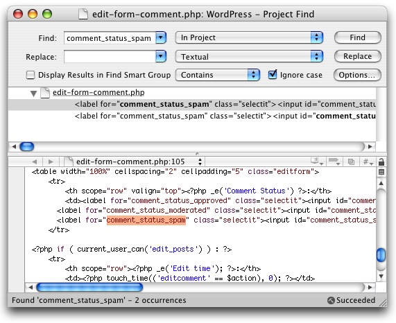
I find that I understand a project much better even by doing simple tweaks like globally replacing something so that it behaves differently. When I can observe the changes, it connects my test changes to the project’s design as a whole.
Next up I attacked the problem of “fixing the workflow.” What does it mean to “build & run” a WordPress project in Xcode? I decided that building WordPress means “copying the files into my local web server directory,” and running it means “opening a suitable URL in my web browser.” To that end, I added a single target to the Xcode project, “Install Local,” which is a simple copy files build phase target. It takes all the specified files and plops them over to the “blog” subdirectory of my local test server:
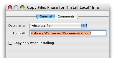
Sweet! Now when I want to try out my changes, I can just press Cmd-B to build and then load up my localhost URL in Safari. But the scenario isn’t quite complete. When I build an application in Xcode, I don’t have to navigate to the Finder, find the resulting product, and double-click it. Why should I have to go manually reload this web page? With Xcode custom executables, I don’t. I added a couple shell scripts to my “hacking” tree that, when specified as custom executables, simply cause the local blog to open up in the default browser. This trick is accomplished with some simple AppleScript bridging:
#!/bin/sh
osascript -e "open location \"http://localhost/blog/\""
For every commonly debugged location in the blog, you can just pop another custom executable into the project with a slightly different blog URL. Then you select the desired executable from Xcode and “run” the project to see how your results are shaping up.
Now I can make changes, build, run, examine the results, and even use Xcode’s built-in Subversion features to review what I’ve changed!
If you want a head start at making your own WordPress hacker’s paradise, you can download and plop my WordPress Xcode Project files into your own local WordPress “hacking” directory. It should work just fine with a standard 2.0.3 copy of the sources. The archive includes the Xcode project itself as well as a couple example “executable” scripts.