FastScripts 2.5
December 29th, 2009Today I released an updated version of FastScripts with some pretty cool features and bug fixes:
- Now supports running plain-text .applescript files
- The FastScripts menu icon can now be changed to a custom color
- Alter appearance of menu so it doesn’t have rounded top corners on 10.6
- Bug Fixes
- Fix glitches with “Smart Switching” on Snow Leopard 10.6
- Fix processing of shell script arguments embedded in the “shebang” line
- Fix a possible crash when changing mouse cursor while selecting from menu
- Fix proper display of filenames e.g. when they contain slashes
I struggled with the question of whether to allow for colorizing of the menu bar icon. I think personally that all icons in the menu bar should be monochrome and approximately black. But the chorus of feedback from people with legitimate accessibility concerns prompted me to give in and provide a preference to set the color of the icon to any color you like. Yes, you can now make FastScripts hideously ugly, with a simple preference change!

Most of the other changes should be obvious from the outline what they imply. The “smart switching” fix will be a welcome change for anybody who started noticing on 10.6 that FastScripts would no longer always become active to make sure a dialog is presented in front of all other windows. I think I’ve come up with a solution that will now withstand the test of time. Special thanks to Mike Ash for a giving me a very helpful clue for solving this issue.
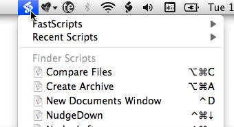
The biggest change from a development point of view is one of the most subtle to the user. Here is the FastScripts 2.5 menu:

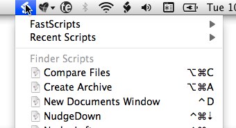
And here is the old FastScripts 2.4 one:

The rounded corners in the old version weren’t too terrible, but there was clearly something wrong. Small blemishes such as this are like a dent in the side of a used car. Is it the only thing wrong with the car, or does it reflect an owner who has not taken care of it, inside or out? Now the FastScripts menu projects solidity and reliability, reflecting its core functionality. Thanks to Nicholas Riley for pointing out this issue and inspiring me to finally fix it. He also reported the issue with script names not being displayed correctly.
An interesting developer side-note: the explanation for the rounded corners are that up until FastScripts 2.5, the menu was entirely Carbon-based. So what you are seeing is a Carbon “pop-up menu” cleverly positioned so that it shows up exactly in the spot where a real menu would appear if I were using one!
When I first developed FastScripts, Cocoa’s menus were not sophisticated enough to handle all of the functionality I needed. So I used Carbon menus inside what is otherwise a Cocoa app. Fortunately I had the foresight to develop NSMenu and NSMenuItem style wrappers for the Carbon menus. Now that Cocoa menus are suitable for my needs, I was able to essentially remove the wrappers and write directly to the Cocoa menus API for a more integrated look (and less code to maintain, down the road!).


December 30th, 2009 at 2:54 am
Hey Daniel, this is great, thanks. I updated and immediately made the icon hideously ugly as per your recommendation. I love it. Good work!
Ian
January 4th, 2010 at 12:53 am
Thanks for paying attention to the accessibility concerns – my icon is now a hideously ugly purple that would make you throw up … and now I can easily open the FastScripts menu every time, instead of accidentally hitting the Skitch and iTap and Character Viewer icons on the way there! :)
r