Designing For The First Launch
January 26th, 2008Brent Simmons writes about designing the first-launch experience for NetNewsWire 3.1. I find his reasoning especially interesting because MarsEdit also has a strong incentive to provide users with a smooth first-launch experience.
One of the points that resonates most for me is Brent’s point about friction:
Present as little friction as possible—don’t overwhelm the new user so that he quits without trying the app. Ask for just the minimum required to make an account: username and password.
I think about friction a lot, both when designing features into my products, and when thinking about how to market them. If you’re an indie software developer and you get me talking for more than about 30 seconds about business, I’ll invetiably start talking about the first-launch experience and how it relates to sales. I call it the “run away screaming” factor.
Every product has shortcomings that will cause some users to run away screaming. The best we can do is try, with each iteration, to make fewer and fewer people do so. If 100 people download your product, and 90 of them run away screaming after launching it once, then you’ve only got a chance of selling to 10 of them. We can assume that statistically, some fixed percentage of the people who remain will end up buying. So cut the flee factor down to 80 and you’ve just doubled your sales.
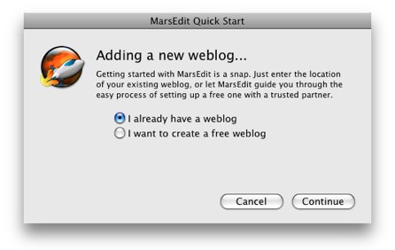
The easiest way to make a user run away screaming from MarsEdit would be to require that they perform some tedious and complicated setup process in order to get up and running. The truth is, most of the time MarsEdit can figure out how to configure everything just by peeking at your blog’s home page. So I try to alleviate that fear with MarsEdit’s very simple first-launch dialog:

The first screen is intended to be inviting to both established bloggers and curious users who just happened to download a copy of the app before they’ve even started blogging.
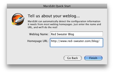
For users who already have a blog, they proceed to the second screen:

By the time users have stopped laughing with joy at how easy the process was, MarsEdit is asking them for their user name and password, and proceeds to download the last several posts from their weblog.
Don’t believe me that it’s so simple? Go ahead, I dare you to try it!


January 26th, 2008 at 8:13 pm
Glad to see people focusing on the kind of detail that really makes the difference. A minor suggestion, why do you need users to type the name of their weblog? Certainly just be providing the URL you could grab the name of the weblog the same way you’re grabbing posts, and then if user’s wanted to rename it some local name afterwards, they could do that once they’re set up.
January 26th, 2008 at 8:28 pm
That’s a great point, Ross. I will have to strive for that in an updated release :)
January 26th, 2008 at 9:21 pm
The Quick Start is great, but I do find it a little odd that the “New Weblog…” menu item opens the same Quick Start window, and that you can go back to the previous step from there. That is, it drops you into the middle of an assistant.
January 26th, 2008 at 9:23 pm
Steve: the idea was to try to reuse the same experience for adding a weblog, regardless of whether it’s part of the first launch or not. Probably a good idea would be to remove the “back” button when it’s being reused. If it wasn’t for the back button, would you find it at all weird that it uses the same UI?
January 26th, 2008 at 10:21 pm
Yes, I think removing the back button, and changing the title of the window to “New Weblog” (or something similar), would be fine.
January 26th, 2008 at 10:29 pm
I read somewhere that ideally a user should be able to sit down at your app and see how to do something useful right away — sort of a different way of stating the first-run principle. Funny that I can’t remember where I saw this, because it stuck in my head as a very important principle of interaction design.
January 26th, 2008 at 10:32 pm
Andy: regardless of where you heard it, it sounds like really sound advice :)
January 27th, 2008 at 12:18 am
Haha – when I first skimmed this I thought you were saying that people would “run away screaming” when you talk about this subject :)
January 27th, 2008 at 1:11 am
Corey: same here!
Otherwise very interesting post :-)
January 27th, 2008 at 2:00 am
Corey & Charles – haha! Maybe true, too :)
January 27th, 2008 at 3:27 am
@Ross:
Not really irrelevant. For instance, when i modify a theme, i usually just add my logo and delete the name from the options pages in wordpress. Or for someone with a custom theme and no title maybe(i know that might be stupid, but it can always happen).
if that is the case the small icon without a name might apear confusing to the user.
maybe you have several blogs: work, personal, diffrent languages etc…..and you might want to have some kind of nickname for it.
January 27th, 2008 at 6:03 am
Interestingly, I ran through this yesterday, as I downloaded and tried MarsEdit for the first time.
I”™m a bit of a weird use case for it, as I don”™t have a blog yet (I”™m intent on rolling my own). I wanted to see what it was like typing stuff into MarsEdit as opposed to TextMate.
I suspect I”™ll set up a little test WordPress blog, via the MarsEdit first run process, to give the app a go. I can always throw it away later.
January 27th, 2008 at 10:27 am
pauldwaite: this is actually a pretty interesting point. It turns out that MarsEdit doesn’t work very well without *at least one* weblog configured. I have it on my list to get it working better, because there are some reasons for typing in it even if there is no configured weblog. Your suggestion of wanting to try out the experience, is one, and also people who prefer composing in MarsEdit but whose weblog doesn’t support any standard client network interface.
January 27th, 2008 at 11:12 am
Too bad ExpressionEngine isn’t supported for auto configuration. :-(
January 27th, 2008 at 11:35 am
Hi Mark – I strongly encourage you to ask for the functionality from ExpressionEngine. A blog service that supports the RSD (really simple discoverability) convention should auto-configure perfectly with MarsEdit.
January 27th, 2008 at 12:13 pm
Thanks. Will do!
January 27th, 2008 at 1:40 pm
Regarding Steve Nygard”™s issue: don”™t remove the Go Back button, change it to Cancel. As Brent mentions, many users won”™t think to look for a close button in a dialog box (even if it”™s modeless, and that distinction is pretty non-obvious in OS X).
January 27th, 2008 at 3:03 pm
Two things:
1) We actually call this whole thing OOBE (out of box experience) here. And yes, it’s damn important to get right for all the reasons you mention.
2) On an unrelated note, your first dialog has too much whitespace at the bottom (actually, I think the second one does too). I know it’s because the second dialog has more info, but I’d personally do a animated resize for each screen to make it fit perfectly.
Your Pal,
–Ed
January 27th, 2008 at 3:17 pm
I’m in almost the same situation as pauldwaite; I want to start writing a blog, but I don’t want to publish it, yet. The startup for MarsEdit is keeping me from using it.
January 28th, 2008 at 2:45 pm
The user experience begins before the user downloads the application. How many products have I walked away from because the author’s home page or product page is a list of release notes. I have no clue from that what benefits the product confers on me, nor what features it uses to achieve those benefits.
As for blogless blogging…I’m an old fart (compared to most of you) and I’ve mostly lost my interest in personal blogging (professional blogging is different). However I would like a really easy to use private diary app. And maybe I’d like to publish passages as a personal blog now an then.
January 28th, 2008 at 2:48 pm
Bob: You might want to check out Journler. From what I understand it fits that bill pretty perfectly.
January 29th, 2008 at 6:19 am
Still no Textpattern support? I understand the configurations are a bit ad hoc, relative to more standardized things like, you know, WordPress, but I recommend you look into it. I could see myself getting really into MarsEdit.
January 29th, 2008 at 12:01 pm
Nick – it just doesn’t make sense from a labor perspective for me to jump through hoops to auto-detect Textpattern, when they could just add a simple RSD tag in their system to make it auto-detect automatically.
It’s quite often the case that when a system doesn’t work perfectly with MarsEdit, it’s 100-times better to fix it in the blog system than in MarsEdit.
January 29th, 2008 at 12:26 pm
(Which is to say, Textpattern *is* supported, but it doesn’t autodetect correctly, because they’re missing the required RSD information.)
Actually Textpattern’s developers have made a great amount of improvement lately to their XMLRPC support, so it might be worth updating to see if they also include improved auto-detection support. You can follow Textpattern’s progress here:
http://forum.textpattern.com/viewtopic.php?id=24487&p=1
(Note, that thread was started by me :) So it’s not like I’m completely cold and uncaring when it comes to Textpattern :) )
January 31st, 2008 at 10:48 am
One suggestion: Add a “bookmarks” popup button next to the URL field, or auto-complete from Safari’s bookmarks list. AFAIK they’re stored in a standard format, and many people have their own blog somewhere in the bookmarks, so this could save your users lots of typing, and make it even less work for them to get started.
It’s the No. 1 rule in UI design: Don’t force your users to type in something the computer already knows.
January 31st, 2008 at 11:53 am
Uli: agreed. This is definitely on my TODO list for the main URL field in MarsEdit’s text editor. Hadn’t thought about doing it in the first-launch window, though. And stealing from Safari’s list could be quite clever indeed.