Invoicing Stunts
January 28th, 2009 It’s not often that software grabs my eyes and heart the way Stunt Software’s updated time tracking and invoicing software, On The Job 3.0, does. Wow, this is the kind of application other developers should look to when they’re wondering whether they’re really giving enough attention to detail in their own applications.
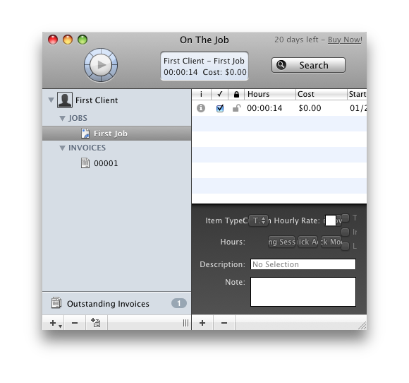
The interface is clean and somewhat traditional, based on a familiar 3-pane layout that is common to applications such as Apple’s Mail and my own MarsEdit. But Stunt Software also takes some innovative leaps, adopting a “HUD style” interface for the in-window attributes editor, a style which Apple typically reserves for full-screen media editing palettes.
I’m a bit of a luddite when it comes to taking these kinds of UI risks, but on the whole they do not strike me as offensive in On The Job. Some aspects, such as the iPhone-inspired odometer-style numeral editors, strike me as questionable for the desktop. They can’t be pushed or pulled and don’t have momentum like their iPhone counterparts, but they do look pretty nice.

One way to justify the gratuitousness of these elements would be to support spinning of the elements with a direct click and drag, or even better with a push of the mouse’s scroll wheel.
Overall, I think it’s fair to say that pushing the limits of UI design is justified and encouraged if a designer is also keeping a careful watch on the finer points of the end result. It’s hard to challenge many of the choices made for On The Job, because it is bursting with clear points of consideration for the user. Consider the default names for clients and jobs. Instead of using the typical “Untitled,” they start with the inspirational “First”. After that, the default language changes to “New.” These are the adjectives we use in everyday life. Nobody starts business with an “Untitled Client.”
Which isn’t to say everything is perfect. I gave the application my patented “scrunch test.” This involves simply sizing a window to the absolute smallest it will go, and observing how the UI reacts. I do it almost by instinct with every new application I try, and On The Job doesn’t exactly shine in this regard:

Notice in particular how the HUD-style elements in the lower right have become a disgusting mess of overlapping words and buttons. I have a litmus test for these kinds of design decisions, where a user’s actions can put my application into a state of embarrassing ugliness or dysfunction. My rule is pretty simple:
Give a user as much freedom as you can without empowering them to make your application look ilke ass.
To this end, I usually restrict the sizes of my windows to the smallest size that can reasonably accommodate the UI in most cases. Obviously, when it comes to uesr-provided data it can be hard to prevent 100% of the ugly scenes, but a situation like this, where buttons simply don’t have room to live, is a clear case for limiting the window’s width.
But in spite of little quibbles, On The Job is a fantastic piece of design and engineering. I would recommend it without hesitation to consultants who bill even one client on a regular basis. I’ve given up consulting myself, but this application is almost enough to make me consider resuming. Perhaps I’ll start tracking my time, and issue myself invoices at the end of the month. Ouch, this blog post is costing me $175!


January 28th, 2009 at 6:07 pm
I gave it a try as soon as you tweeted it. I cannot but compare On The Job to Billings3, and I’d say that On The Job wins hands up. Billings3 has a also a polished UI, but I much prefer the minimalism of this app’s approach. And although this app seems more targeted at time tracking (rather than invoicing or sending estimates) it seems to cover more ground than Billings. It’s more targeted, but at the same time more attentive to the details. To mention one, multiple currencies support, the one missing feature that convinced me not to buy Billings after the expiration of the trial period. I guess I won’t let this trial period expire.
Still, I agree on your take on the iPhoney (ambiguity meant) details. They’re a bit out of place, but hey, this guy is tracking a new territory. I’d say this app, together with The Hit List, has the most significant innovations in terms of UI I’ve seen recently.
Cheers,
Davide
January 28th, 2009 at 7:50 pm
That is exactly how I decide the minimum size for my windows.
January 29th, 2009 at 1:38 am
I tried On the Job, but although the interface is pretty the functionality still doesn’t hold a candle to OfficeTime for my use (why does everyone focus on invoices without paying temporary reports, a la OfficeTime, the attention they are due?). I also wasn’t a big fan of the level of complexity (you have to travel down three levels of hierarchy before you hit a timing session, and even then its broken up into pieces).
I had great hope for On the Job 3, but I think the above comparison to Billings 3 is most apt. If you like Billings, you’ll probably like On the Job 3. For us OfficeTimers, though, it isn’t worth the switch.
February 2nd, 2009 at 1:08 am
Another UI problem: open the Address Book sheet and try to resize it. Uh oh.