Some readers pointed out that in announcing FlexTime 1.1, along with its snazzy new interface, I left out some of the most interesting details to programmers. How did I accomplish all of the little things that add up to the new UI? Like everything else in life, you just bite off a little bit at a time, and hope for the best. And also like everything in life, it seems a lot easier once you’ve done it. But looking back I can see a lot of discrete obstacles that I had to overcome, and perhaps my path through the wilderness will prove helpful to you. I’m going to go over the steps that made up the redesign in roughly chronological order, including links to existing open source packages that I used, and also releasing some small contributions of my own for your review.
Inspiration
Before anything else, you’ve got to be inspired to change. That might sound fluffy, but it’s absolutely critical. If you’re not convinced that your UI needs an overhaul, then you might as well forget it. You can rub sticks together for an eternity, but if you’re not cold, you’ll never start a fire. You have got to be dissatisfied with something before you can make it better. For reference, this is what I was becoming increasingly dissatisfied with before embarking on this journey:
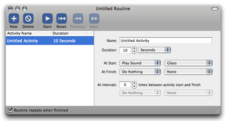
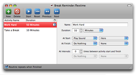
I was pretty happy with FlexTime 1.0 when I released it. It did the job. I had never designed toolbar icons before, so I felt pretty good about the matte blue stencils I came up with using NodeBox. Hey, that was a nice piece of work for a newbie UI designer who is just trying to get something out the door. But it quickly started to grate on me. The interface was not suited to evolution. The inequities between the square corners of the list view and the round corners of the details box made it hard to embed anything more complicated than the few standard controls I have in there now. I was trapped my 1.0 interface, but I couldn’t figure out what needed to be done to fix it.
What followed was basically a month or more of working on anything but the interface. I couldn’t bear it. I found myself frustrated whenever I looked at it, because I knew something drastic had to change. But what? I worried I might have to scrap the whole thing and start from scratch.
Then I was sitting in Chicago at C4, listening to John Gruber talk about the “death of the HIG.” He brought up Brent Simmons, using his NetNewsWire as an example of somebody who had made a big impact by stepping outside the HIG guidelines. What Brent had done was an app that had broken with traditional HIG guidelines by eliminating the margins around the main views in his window. That’s when it struck me: “I’ve got too many margins.” I immediately envisioned FlexTime with its list view and details pane flush against the left and right edges of the window. That was it. I just realized that was where I’d start, and left it in my head to sink in. I spent the rest of the weekend on not really thinking about it.
Losing The Margins
When I got home, I didn’t waste much time getting to work on this. I busted open Interface Builder and started moving stuff around. About the only “gotcha” with this exercise is getting the UI to look good flush against the edge. A trick I discovered (and recently saw repeated by Brent Simmons on a mailing list) is that many views, table view included, will look best if its border is hidden off the edge of the screen. To accomplish this, you can simply set the x origin of the view to -1. This is a good trick to keep in your back pocket for a variety of finishing touch-ups.
I realized quickly that zero-margins on the left and right sides made the text labels and associated whitespace above the respective sections look stupid. Gasp! Could I just take those labels out? But the user will be lost without them! The main instructiveness of those labels was to tell the user that the list on the left was an “Activity List.” I discovered that by changing the main column’s label from “Name” to “Activity Name,” I could get this point across well enough without using a sledgehammer to drive it home.
A Touch Of Polish
I also decided pretty early on that the streamlined look might go well with one of the “polished metal” looks from Apple’s suite of applications. I ended up using PolishedWindow, which masquerades as “TunesWindow” on Matt Gemmell’s web site. He basically put together an NSWindow subclass that draws its background with a bunch of images to match Apple’s iTunes-ish windows. This was a real simple change to integrate. If I get time I might try to improve the code by getting it to use computed gradients instead of images. I feel like the code could probably be a bit faster during resizes. But for a quick fix this was a real champ.
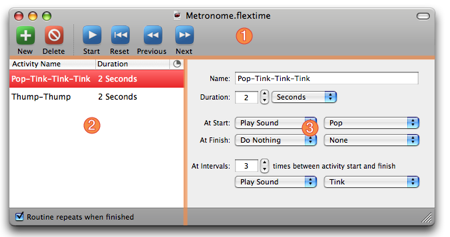
Well shoot howdy, that looks pretty good. It’s such an improvement to my eye that I was frankly about ready to call it a day and ship it. But once you start moving, the inertia of change pulls you along until it’s ready to slow down. You set out to change one thing, and can’t estimate how many changes you’ll ultimately end up making. I showed the screenshot to a few friends, and what do you know, they found plenty to complain about. The icons looks out of place. There is no dividing ridge between the content and the top/bottom sections. The selection of the table should be a gradient. What’s that funny blank column at the end of your table? Pinstripe grey looks wrong in a polished window. The problem with having smart friends is they always have an opinion. You’ve got to learn to dismiss some feedback as a matter of taste. People feel passionately about Coke and Pepsi, but what do you know, they’re both successes. But often the things that rankle one person are going to upset a lot of others, too. So I take early feedback seriously. I might argue with a person, if only to make them justify why their suggestion is right. When the feathers have settled, usually it turns out that they were right, and I’m wrong. So I fix it.
Pinstripes, Ridges, and Gradients
It’s hard to see the pinstriping in the above screenshot, but trust me, it’s there. It’s not so bad, because it sort of blends visually to a light grey, but it really bothered some friends who saw it as out of place in the polished window. I also decided to add a gradient shine to the table view selection, and some defining “ridges” between the main content and the toolbar on top, and bottom section on the bottom.
The ridges are probably the most embarrassing of the three solutions, so I’ll start with them. I don’t know what the heck I’m doing. I’m a frickin’ professional, but I’m also an amateur. We all are. Professionals are just amateurs who know it’s not worth faking like you know something you don’t. In all seriousness, one of the things that makes me a professional is my ability to prioritize “working code” over “correct code.” I look at those ridges, as they appear in something like iTunes, and all manner of possible solutions spring to mind. I can rewrite the window subclass to draw the ridges as part of the background. Or I could devise a special “polished window content box” that draws the desired outline on the top and bottom edges. But the simplest solution at the time seemed to be popping arbitrarily colored “divider lines” into the UI at the appropriate spots.
I for one have always taken the “divider” for granted. It’s such a simple UI element. Usually you drag it in from Interface Builder and let it sit there undisturbed for the life of your product. But I want a colored divider line. In fact, I want four of them, positioned just right so they look like fancy iTunes ridges. In Cocoa, it turns out that divider lines are a very special variant of NSBox! Who knew? So I set about subclassing NSBox to provide colored divider lines. RSColoredBox should really be called RSColoredDivider or something that is more honest about the presumptions the code makes. I don’t think it will make a very good colored box, per se. I thought it would at first, but it turns out that the way Cocoa and IB plop down “divider boxes”, they have boundaries that lie. Divider boxes are of a special variant and are actually much taller or wider than you’d assume. Anyway, use that code if you want a colored line in your interface. Just drag a divider in from IB, set its custom class to “RSColoredBox,” and then call “setBoxBorderColor” on the line at awakeFromNib time. Cheap hacks, baby. Take it or leave it.
Getting rid of the pinstripes in my NSTabView is also not quite as simple as one might guess. This is one of those moments where you think “why doesn’t NSTabView have a backgroundColor attribute?!” The options for NSBox are that you can have it draw nothing, or draw pinstripes. Tough love. The cheapest way I could find to work around this deficiency was to subclass NSTabView and take over the drawing mechanism. Instead of drawing pinstripes, which is all the parent class does, I’ll just fill a rect. Again, this isn’t a very robust class – it only works when the tab view is … tabless. C’est la vie. RSColorBackgroundTabView is available for your perusal.
Finally, the gradient table view. This is one of those things that can be done right, or any of a million varieties of wrong. I was lucky to discover that Wil Shipley had written, during his time at Omni, a perfectly reasonable gradient-highlighting table view. You’ll need to snag the code from OmniAppKit, where it’s provided with the same license as everything else in that fine package. The things Shipley’s code does right are that he computes the gradient programatically, and he obeys the user’s highlight color. These two qualities made the code an easy sell for me.
Pie In The Sky
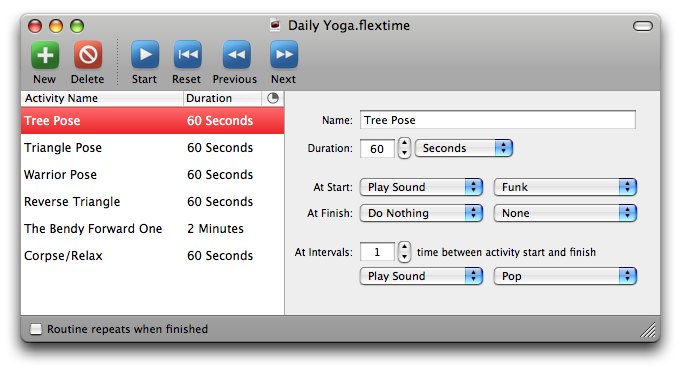
The “empty column” in the screenshot above corresponds to the animated pie-chart progress that is displayed when a user is running a FlexTime routine. It becomes obvious what it is, as soon as you start running something. But I had to agree with my critics, a blank column header is kind of a cop-out.
My first thought was to simply reuse the excellent pie chart cell I use for the table content, which is based on Jon Wight’s Toxic Progress Indicator. I allocated one, configured it appropriately, and then “setHeaderCell:” on the NSTableColumn. This sorta kinda worked, but there were major drawbacks. First, the drawing of the pie chart at that size revealed aliasing problems that didn’t really look polished. I’d have to edit the code to improve the compositing over the background, or something. Second, when you take over responsibility as a header cell, you take over all responsibility. You’ve got to draw that cute polished background, in addition to the content. Now I’m sure I could have gotten this all to work, by employing the existing default table header cell to do some of the heavy lifting, or by subclassing it. But I heard a little voice in my head screaming “overengineering!” so I took a step back. Paul Kim pointed out that I could simply “setImage:” on the existing header cell, and it would draw it for me, nicely composited over the polished background. Why go to the trouble of dynamically generating a pie chart image when one put together in PhotoShop will look just as good and be 100% predictable?
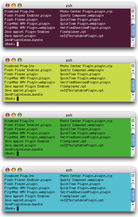
The image looks pretty good in the table header, but what’s that ugly crud on the edge? Why is it that I can’t spend more than 15 minutes at a computer without finding a bug in somebody else’s code? It’s the curse of the tester. I started my career in Quality Assurance and I’m doomed now to forever discover all the bugs. What’s going on here? It’s a bug in NSScrollView, or NSTableView. When a table view suddenly acquires a vertical slider, it causes the existing table headers to scrunch up and make room. In the space formerly occupied by the right-most table header, a special view is inserted called the “corner view.” This view is responsible, normally, for just drawing an empty background. After some debugging I discovered that when an NSTableView acquires a scroll bar, the cornerView is made visible, but not asked to redraw. That means whatever was on the screen before it appeared just gets left there. Usually you get lucky, because what was there is blank table header background. Most table headers are left-aligned (only on left-to-right language systems?), and the text rarely reaches the far right edge of the table. Leave it to me to find the exception.
When I run into a bug like this, I like to confirm as quickly and definitively as I can that it’s not my problem. If I take a simple project, like Apple’s “OutlineView” developer example, and cause it to have text that runs up against the right edge, then I see the same bug:
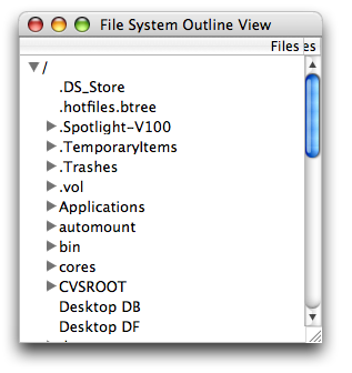
(Radar #4818521)
A workaround is to aggressively listen for table column resizes, and force the corner view to redraw itself whenever this happens:
- (void)tableViewColumnDidResize:(NSNotification *)notification
{
   // Force the tableview's cornerview to redraw.
   [[oTableView cornerView] setNeedsDisplay:YES];
}
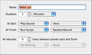
Clickable Text
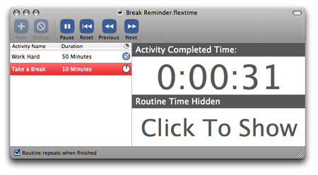
One of the biggest payoffs of this redesign was that it suddenly made the most ambitious part of my evolving UI a lot more palatable. I heard loud and clear that people were asking for large timer feedback while a routine was running, but I was having a hard time integrating it into the FlexTime UI. While the timers are not perfect, I do think they fit in a lot better in the margin-free context of FlexTime 1.1.
It’s worth talking a little bit about that custom UI. I wanted to satisfy two major design requirements:
- The time display should be large and easy to read.
- The time display should be easy to configure and disable.
I decided on large clickable displays. The simplicity of changing a configuration by simply clicking it is hard to argue with. Don’t like what you see? Click it and see if it gets better. I haven’t had a lot of feedback yet, but I suspect this “implicit configuration” is probably much preferable to a preferences panel or something where the options are painfully selected from a list of radio buttons.
Now if you’re like me and tend to stick with standard UI pieces, you’re probably wondering how I put that little piece of work together. One reasonable approach would be to design a custom NSView subclass and handle all the hit testing and state changes in there. In fact, that’s probably a smarter way to go about things, but for whatever reason I tended towards the “design entirely in IB” path this time around. The “custom view” in this case is an elaborate contraption formed out of NSTabViews, bindings, and clickable NSTextFields. When you click an NSTextField, it changes the “view mode” for the display, which is a property of the document. An NSTabView contains the three view modes, and is bound by its “selectedIndex” binding directly to the viewing mode (conveniently an enum that matches the NSTabView indices). The text fields for the time displays are bound directly to “time remaining” or “time elapsed” values, which are NSTimeInterval values (double precision seconds). To present the clock-style format I attach a value transormer, RSTimeIntervalToClockStyleFormat, which turns the seconds into a pretty string as shown.
If you imitate this approach, you’ll soon learn that NSTextField is not clickable by default. But it is an NSActionCell. It has these qualities but normally only uses them in an editable context, where the target/action paradigm is applied when the value changes or editing ends. To extend the functionality to mouse clicks, simply subclass NSTextField (mine is RSClickableTextField) and override mouseDown:
- (void)mouseDown:(NSEvent *)theEvent
{
   [self sendAction:[[self cell] action] to:[[self cell] target]];
}
Buttons 2.0
By this time, things are really starting to look good. My margins are gone. I’ve got my gradient. My light grey background. My polish. My pie chart header cell. Up to this point people have been screaming about the buttons, but I’ve been laughing it off. Haha! Maybe for 1.2. I just couldn’t muster the psychic energy to tackle such a big part of the UI. But the incongruence of those flat buttons was really starting to gnaw at me. I decided to take a stab at improving at least the color, and it quickly turned into a day-long obsession.
While the original buttons were entirely built from NodeBox, I decided I needed to add some lighting effects and anti-aliasing that were simply not feasible in NodeBox. So I started with the NodeBox generated images, but set up a PhotoShop document to apply various manipulations to the images by filter layers, semi-transparent gradients, etc. It was a learning experience, but I’m pretty happy with the results.
As you can imagine there was a lot of tweaking and testing in this process, and one of the best things to come of it was my decision to build a “Generate Toolbar Icons” script. I organized my PhotoShop document in such a way that all of the various toolbar icons are in one document, so to save a particular icon you just hide all the other buttons’ layers. This is cool because all the effects layers and gradients are consistent and can be changed in one place, where you’ll be sure they apply to all of the buttons.
Hiding and showing the layers would be tedious to do by hand, but PhotoShop’s “layer set” concept makes it easy to script. By putting all the toolbar buttons in a layer set called “Buttons,” I am able to easily hide all of them:
	set buttonSet to layer set "Buttons" of myDoc
	set visible of layers of buttonSet to false
Then I can iterate through all the layers in that layer set, setting the visibility of the layer to true, exporting a copy of the image, and setting the visibility back to false:
repeat with layerIndex from 1 to count of layers of buttonSet
	set thisLayer to layer layerIndex of buttonSet
	set visible of thisLayer to true
	set outputName to outputPathRoot & name of thisLayer & ".png"
	save myDoc in outputName as PNG with copying
	set visible of thisLayer to false
end repeat
If you’ve used PhotoShop to “Save As,” you know how painful it is to constantly go through the options dialogs. AppleScript makes exporting even one image easier, but with my script I can easily regenerate all nine icons and spit them out directly into the appropriate source directory.
Wrapping Up
The only downer to doing a GUI redesign is that all of your pictorial documentation becomes instantly obsolete. After the relatively fun work of designing the graphics and tweaking the layout, I realized I’d have to redo all of my Help Book graphics, and the screenshots for download sites and my web page. The lesson I learned from this is that to whatever extent possible, you should keep the “art” separate from the notation. For instance in my documentation I include a screenshot with various annotations made upon it:
In 1.0, I foolishly generated this graphic in Pages or something, and saved it as a bitmap image. Dumb, dumb, Daniel. From here on out I’ll be conscientious about saving with layers and keeping the application UI “swappable” with a new graphic, where only minor adjustments might need to be made to the overlays.
That’s the story of how FlexTime got its HIG on. Hope you enjoyed it picked up a few new tricks along the way.