As Twitter becomes more and more popular, the quality of tweets (Twitter updates) seems to be taking a dive. I attribute this to a couple side effects of the relentless population rise:
- An increase in conversational, challenging, and defensive tweets.
- The use of tweets to mass-distribute unoriginal ideas and propaganda.
Conversational Tweets
I wasn’t among the earliest adopters of Twitter, but I’ve been a member long enough to remember the days when you were more or less likely to know everybody you followed, and vice-versa. In this environment, Twitter’s concept of a “reply tweet” was ideal, facilitating a mix of public statements and conversation among friends.
As the Twitter ranks grew, it became more common to stumble upon people we don’t know, but whose work we admire, or whose thoughts are original and worth reading. I follow a number of people whose reputation is well known to me, and they have no idea who I am. This is fine, because I am getting something of value from their tweets, while my quiet observation is generally of no bother to them.
But Twitter’s egalitarian implementation of reply tweets allows responses to tweets even from somebody you don’t follow. This has many positive effects, because a genuinely helpful or insightful person can respond intelligently to a tweet, and have a fair amount of confidence that the original author will receive their feedback. In short, Twitter replies enable the masses come to your aid, sing your praises, or perhaps less conveniently, to call you on your bullshit.
Calling bullshit can be a useful service, but on the internet it tends to become a pathological blood sport. Some members of internet society become so invigorated by the opportunity to prove somebody wrong, that they’ll stop at nothing to quench their thirst for victory. They stretch facts, bend logic, and insinuate false intentions for the chance at glory. The chance to prove you wrong on Twitter.
So here we have a system on which millions of users stake their personal reputation, and where some significant percentage of users makes a pathological game of trying to assassinate those reputations. The more followers you have, the greater the number of idea assassins you have at your quite unfortunate beck and call. When even the most innocuous of statements invites pointless scrutiny, the original author is bound to get defensive. This leads to an unfortunate and noisy interchange that looks something like this:
- MacLover: Man, these new MacBooks looks awesome, but I don’t think I can buy one unless they put Firewire ports back on them.
- Apple4Ever: @MacLover If you hate Macs, you should just buy a PC. There’s no point in complaining about it. Just buy a PC if that’s what you want.
- MacLover: @Apple4Ever What are you talking about? My freaking name is MacLover. Of course I love Macs. I was just making an observation about the new
- MacLover: @Apple4Ever MacBooks, they’re sooo close to being perfect. I wish they would make a MacBook that is as fine-tuned as the old PowerBook 12″.
- Apple4Ever: So buy a PowerBook 12″.
- * MacLover Head Asplode *
This conversation is agonizing enough for the people involved, but the poor followers of MacLover and Apple4Ever had to follow along, utterly disinterested (unless they turned on “Only show me @replies to people I follow,” which can be a good idea). In this scenario, Apple4Ever is assassinating MacLover’s ideas, scraping the bottom of the barrel for any controversy that could possibly lure MacLover into a personal dialogue.
People in MacLover’s position would do well to ignore such bait, but it’s not always clear cut. The 140 character limit in Twitter makes it difficult to completely express a thought without ambiguity. Conversational moods such as sarcasm and irony are hard to convey, and the audience is filled with people who are chronically deaf to such tones.
So Twitter is filled with people who care that their thoughts be expressed with accuracy and meaning. And it’s also filled with people who, because of boredom or lack of attention, are hell-bent on causing rifts that invite confrontational interchange. This is a recipe for lots of misunderstandings and escalating hostility. It sucks, man.
To improve the quality of conversational tweets, I propose a little more consideration on both sides of such conversations:
- To the would-be idea assassin: take a step back and examine the tweet you’re responding to. Does it actually say what you’re alleging it says? Are you making a leap of logic to start an argument, just because you’re in the mood for a debate?
- To the would-be defensive tweeter: breathe. The person egging you on is one drop in a puddle next to a lake abutting an ocean. Their provocative tweet is only visible to you and some subset of their followers. Chances are, most people will never see it.
I’d like to think I’m never the idea assassin myself, but I am sure we all have the tendency sometimes. As for the defensive tweeting, I’m positive that I do it to a fault. So I’ll be trying especially hard to take my own advice #2 above.
Tweet Propaganda
Twitter connects a hell of a lot of people. The idea that a simple viral tweet message could prompt others to act in a manner that itself perpetuated further tweets, is irresistible to commercial marketers and internet stuntmen. The simplest form of viral propaganda on Twitter is the simple word-of-mouth repetition of ideas in an author’s own voice. I wrote about Word Of Tweet Marketing just over a year ago, after being impressed by the growing impact Twitter was having on my own company’s sales and reputation.
As people recognize the power of word-of-mouth dissipation, it becomes tempting to spread every good idea that comes along. Every funny joke. Every classic YouTube video. Every friend worth following. Since people are lazy, and rephrasing an idea in one’s own voice takes time, the phenomenon of the “retweet” emerged. People annotate a tweet with “RT @whoever”, implying that the contents are being more or less repeated verbatim. Great for the spread of ideas, terrible for the individual personality of a Twitter account.
But even a retweet involves some personal involvement by the account owner. More and more, we’re seeing examples of tweet propaganda where the contents of the tweet are entirely machine made. A classic example occurred a few weeks ago, when a steady flow of “Don’t click this URL” messages began pouring into peoples’ tweets.
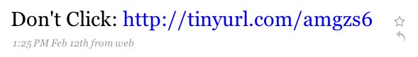
The gist of this prank was that clicking the URL took you to a page where, if you clicked another URL after being warned not to, it would submit a tweet to Twitter under your logged in account name. A classic example of the power of reverse psychology.
There was no financial gain for the perpetrators of this idea virus. Just the satisfaction of Twitter being virtually painted, for a few hours, with identical tweets from thousands of different accounts. People who fell for the trick were embarrassed and apologetic, recognizing that the tweet was not only of no value to their followers, but also posed the risk of snaring them into the same gag.
In other cases, the propaganda is voluntarily added to a person’s twitter stream. Some vanity services, for example, will do an analysis of your twitter account and tweet the results with your permission. Often, the permission is thinly veiled or questionable, and users end up apologizing that they “didn’t realize it was going to tweet that.”
Tweet propaganda is still young, and people are still grappling with where to draw the line. By engaging in a viral process of any kind on Twitter, you’re trading your originality to be part of a larger scheme. Depending on the terms of the scheme, it could be beneficial to you and your followers, or it could be annoying and embarrassing.
Just a few days ago, a controversial form of tweet propaganda came by way of the MacHeist promotion. Their so-called TweetBlast rewards buyers of their bargain software bundle with extra software if they agree to let their Twitter account be used to promote the bundle. If you follow more than a few Mac users, you’ve no doubt seen the tweets by now:

One of the nice things people like to do is share information about great deals. This makes viral marketing a natural avenue for sales and bargain discounts. But there’s a distinction between a person, writing in their own voice to endorse a sale, and a mechanized robot puking thousands of tweets into the system on behalf of users looking for a freebie.
Michael Lopp recently wrote about The Art Of The Tweet, and touched upon something that I think is important and appropriate for this discussion. In a section titled “Add a Bit of Yourself”, he discourages the excessive use of re-tweeting, and opens with a bold rationale for this discipline: Twitter is you.
More Of You, Less Of Them
Ultimately, the quality of tweets is closely related to how much of you there is in them. When you forfeit your individuality to a commercial promotion, or to the vain attempt to either defend your own honor or assassinate somebody else’s, you compromise your own tweet quality.
Whenever anybody complains about some aspect of Twitter, a fair number of people like to respond reflexively: “If you don’t like something, don’t follow them.” This advice is fine, but apply it to the other fine things in life, and you quickly find that it leads to stasis, a situation where the state of the art does not advance for lack of iteration and refinement. If nobody reviews and offers opinions on books, movies, fine arts, poetry, etc., then they are all liable to degrade in quality over time.
My intentions in being critical of Twitter and the state of declining tweet quality is not to bask in my own whining or seek consolation or apology. I honestly think that by rethinking the situation, we’ll decide what kinds of tweets are of best service to us all.
Certainly, different subsets of Twitter will have differing standards. There is room enough in Twitter for all attitudes and priorites, but I’ll be filling my follow list with the people who put the “you” into Twitter.